
In this post we will learn how to color scatter plots using another variable in the dataset in R with ggplot2. Scatter plots are extremely useful identify any trend between two quantitative variables. However, often you have additional variable in a data set and you might be … [Read more...] about How To Color Scatter Plot by Variable in R with ggplot2?
R
How To Color Boxplots By a Variable in R with ggplot2?

In this tutorial, we learn how to color boxplots in R by a variable. With ggplot2 in R, we can color boxplots in multiple ways. In this post, we will first see how to make a simple boxplot in R. And then we will learn how to fill the boxes on boxplot by a variable. Then we will … [Read more...] about How To Color Boxplots By a Variable in R with ggplot2?
Introduction to Color Palettes in R with RColorBrewer
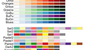
Choosing colors for data visualization in R is hard—especially if you want charts that are clear, consistent, and inclusive. The RColorBrewer package (based on a href="http://colorbrewer2.org/">ColorBrewer2) gives you carefully designed sequential, diverging, and qualitative … [Read more...] about Introduction to Color Palettes in R with RColorBrewer
How To Add Mean Line or Vertical Line to Density Plot with ggplot2?

Adding a vertical line on mean or median value of a distribution to its density plot can make understanding the plot easier. In this post, we will first see a simple example of adding mean line to a density plot using ggplot2 in R. And then we will also see an example of adding a … [Read more...] about How To Add Mean Line or Vertical Line to Density Plot with ggplot2?
Horizontal Boxplots with ggplot2 in R
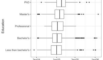
Horizontal boxplots are useful when you are making a boxplot multiple groups & you want the group names to be easily readable. And horizontal boxplots can also make it easy see the pattern among the groups quickly. In this post will learn how to make horizontal boxplots with … [Read more...] about Horizontal Boxplots with ggplot2 in R