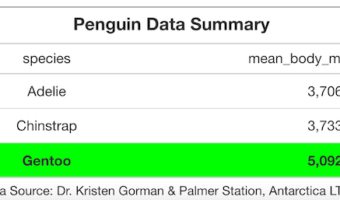
Making tables as part of your data visualization strategy can be a hit or miss. For example, a table with too many numbers screams for a plot instead of a table. Basically, challenge lies in using tables at the right time in right way. Luckily, we are in a much better position … [Read more...] about 6 Tips to Make Beautiful Tables with R Package gt
R
How To Make Heatmaps in R with ComplexHeatmap?

Heatmaps are a great way visualize a numerical dataset in a matrix form. Basically, a heatmap shows the actual data values as colors. When there is a broad trend in data, like change in data over rows or columns of data, a heat map makes it easy to see the broader trend. In … [Read more...] about How To Make Heatmaps in R with ComplexHeatmap?
How to Make Heatmaps in R with pheatmap?
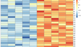
Heatmaps are one of the ways to visualize quantitative data in two dimension. Heatmaps show the actual data as colors and can reveal common patterns easily. In R, there are multiple ways to make heatmap starting from data in matrix form. In this post, we will learn how to make … [Read more...] about How to Make Heatmaps in R with pheatmap?
How to Save Multiple DataFrames to a Single Excel File in R?
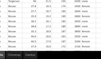
Int his tutorial, we will see how to save a dataframe into an excel file in R. We will use the R package openxlsx to save dataframes as xlsx files. We will start with writing a single dataframe into an excel file with one sheet. Next, we will see how to save multiple dataframes … [Read more...] about How to Save Multiple DataFrames to a Single Excel File in R?
How To Make Scree Plot in R with ggplot2
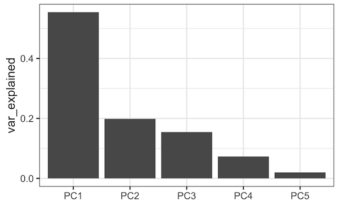
PCA aka Principal Component analysis is one of the most commonly used unsupervised learning techniques in Machine Learning. PCA on a high dimensional data can reveal the pattern or structure in the data. Scree plot is one of the diagnostic tools associated with PCA and help us … [Read more...] about How To Make Scree Plot in R with ggplot2