In this tutorial, we will learn how to make the axis text bold in a plot made with ggplot2 in R. Axis text in a plot refers to the text annotating the tick marks on x and y-axis. By default the axis text around tick marks are not in bold font and here we will make the axis text … [Read more...] about How to Make Axis Text Bold in ggplot2
R
Pair plot from scratch with tidyverse
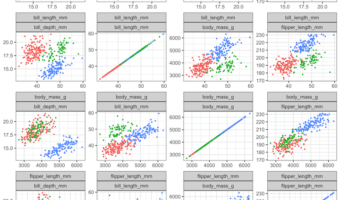
Pair plot is a simple way to quickly visualize the relationship between multiple variables in a dataframe. In this post, we will learn how to make a simple pair plot from scratch between a few quantitative/numerical variables using basic tidyverse functions. (H/T to a twitter … [Read more...] about Pair plot from scratch with tidyverse
How to Add Caption to a Plot in R

In this tutorial, we will learn how to add caption to a plot made with ggplot2 in R. Caption in R is a small text at the right corner of a plot that adds some value to the plot. We will use faithful eruption data available from built-in dataset in R. Simple plot … [Read more...] about How to Add Caption to a Plot in R
How to order boxes in boxplot with fct_reorder in R
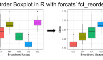
In this tutorial, we will learn how to order boxes in boxplot made with ggplot2 in R. There are a few ways to order boxes in a boxplot. Earlier, we saw how to use base R's reorder() function to order the boxes in boxplot based on the median values of another variable in the … [Read more...] about How to order boxes in boxplot with fct_reorder in R
How To Make tSNE plot in R
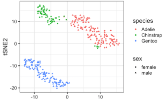
tSNE is dimensionality reduction technique suitable for visualizing high dimensional datasets. tSNE is an abbreviation of t-Distributed Stochastic Neighbor Embedding (t-SNE) and it was introduced by van der Maaten and Hinton. In this tutorial, we will learn how to perform tSNE in … [Read more...] about How To Make tSNE plot in R