• Skip to primary navigation
  • Skip to main content
  • Skip to primary sidebar

Data Viz with Python and R

Learn to Make Plots in Python and R

  • Home
  • Python Viz
  • Seaborn
  • Altair
  • R Viz
  • ggplot2
  • About
    • Privacy Policy
  • Show Search
Hide Search

Scree plot

How To Make Scree Plot in R with ggplot2

datavizpyr · August 21, 2020 ·

Scree plot: barplot with geom_col()

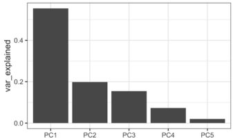
PCA aka Principal Component analysis is one of the most commonly used unsupervised learning techniques in Machine Learning. PCA on a high dimensional data can reveal the pattern or structure in the data. Scree plot is one of the diagnostic tools associated with PCA and help us … [Read more...] about How To Make Scree Plot in R with ggplot2

Filed Under: ggplot2, R, Scree plot Tagged With: PCA scree plot, scree plot R

Primary Sidebar

Tags

Altair barplot Boxplot boxplot python boxplot with jiitered text labels Bubble Plot Color Palette Countplot Density Plot Facet Plot gganimate ggplot2 ggplot2 Boxplot ggplot2 error ggplot boxplot ggridges ggtext element_markdown() Grouped Barplot R heatmap heatmaps Histogram Histograms Horizontal boxplot Python lollipop plot Maps Matplotlib Pandas patchwork pheatmap Pyhon Python R RColorBrewer reorder boxplot ggplot Ridgeline plot Scatter Plot Scatter Plot Altair Seaborn Seaborn Boxplot Stock Price Over Time Stripplot UpSetR Violinplot Violin Plot World Map ggplot2

Buy Me a Coffee

Copyright © 2025 · Daily Dish Pro on Genesis Framework · WordPress · Log in

Go to mobile version