
In this tutorial, we will see examples of how to make grouped violinplots using ggplot2's geom_violin() function. Violinplots are like boxplot for visualizing numerical distributions for multiple groups. In comparison to boxplot, Violin plot adds information about density of … [Read more...] about How To Make Grouped Violinplot with ggplot2 in R?
ggplot2
Best ggplot2 Themes to Make Your R Plots Look Professional (2025 Guide)
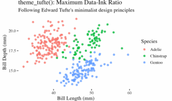
Creating professional-looking data visualizations in R starts with choosing the right ggplot2 theme. While ggplot2's default gray theme works for basic plots, selecting the right theme can transform your visualizations from amateur to publication-ready. In this comprehensive … [Read more...] about Best ggplot2 Themes to Make Your R Plots Look Professional (2025 Guide)
How To Place Legend Inside the Plot with ggplot2?
Need to save space or create more polished visualizations? This comprehensive guide shows you exactly how to place ggplot2 legend inside plot using multiple positioning methods, with ready-to-use code examples that work for any chart type. Default legend placement outside the … [Read more...] about How To Place Legend Inside the Plot with ggplot2?
How To Add Labels to Grouped Barplot with Bars Side-By-Side in R?
In this post we will learn how to add labels to bars on barplot that is stacked side-by-side. We will start with making side-by-side grouped barplot and work our way through adding annotation on top of each bar of the stacked barplot. Adding annotation to grouped barplot with … [Read more...] about How To Add Labels to Grouped Barplot with Bars Side-By-Side in R?
How To Connect Paired Points with Lines in Scatterplot in ggplot2?

Scatter plots are a great way to visualize the trend between two quantitative variables. Sometimes, you may have paired quantitative variables and would like to see the how the pairs are related. For example you may have two quantitative variables corresponding to two different … [Read more...] about How To Connect Paired Points with Lines in Scatterplot in ggplot2?