• Skip to primary navigation
  • Skip to main content
  • Skip to primary sidebar

Data Viz with Python and R

Learn to Make Plots in Python and R

  • Home
  • Seaborn
  • Matplotlib
  • ggplot2
  • Altair
  • About
    • Privacy Policy
  • Visualizing Activation Functions in Neural Networks
  • Confusion Matrix Calculator
  • Visualizing Dropout Rate in Neural Network
  • Visualizing Loss Functions in Neural Networks
  • Show Search
Hide Search

ggplot2 geom_smooth()

How To Make Scatter Plot with Regression Line with ggplot2 in R?

datavizpyr · May 4, 2020 ·

Scatter Plot with gam Regression line with ggplot2 in R

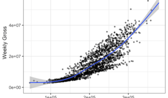
Adding regression line to scatter plot can help reveal the relationship or association between the two numerical variables in the scatter plot. With ggplot2, we can add regression line using geom_smooth() function as another layer to scatter plot. In this post, we will see … [Read more...] about How To Make Scatter Plot with Regression Line with ggplot2 in R?

Filed Under: ggplot2 geom_smooth(), R, scatter plot with regression line Tagged With: ggplot2, R

Primary Sidebar

Python & R Viz Hubs

  • Seaborn Guide & Cookbook
  • ggplot2 Guide & Cookbook
  • Matplotlib Guide & Cookbook
  • Confusion Matrix Calculator
  • Visualizing Activation Functions
  • Visualizing Dropout
  • Visualizing Loss Functions

Buy Me a Coffee

Copyright © 2026 · Daily Dish Pro on Genesis Framework · WordPress · Log in

Go to mobile version