• Skip to primary navigation
  • Skip to main content
  • Skip to primary sidebar

Data Viz with Python and R

Learn to Make Plots in Python and R

  • Home
  • Seaborn
  • Matplotlib
  • ggplot2
  • Altair
  • About
    • Privacy Policy
  • Visualizing Activation Functions in Neural Networks
  • Confusion Matrix Calculator
  • Visualizing Dropout Rate in Neural Network
  • Visualizing Loss Functions in Neural Networks
  • Show Search
Hide Search

ggplot2 extension

ggpointdensity plot: A ggplot extension combining scatter plot with density plot

datavizpyr · June 1, 2020 ·

scatterplot with density using ggpointdensity_

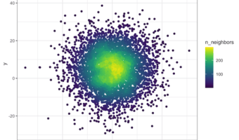
Scatterplots are great for visualizing relationship between two quantitative variables. However, it suffers from overplotting when the number of data points is large. Another solution is plot the density instead of actjual points. However, sometimes you might want to see the … [Read more...] about ggpointdensity plot: A ggplot extension combining scatter plot with density plot

Filed Under: ggplot2, ggplot2 extension, ggpointdensity plot, R Tagged With: ggplot2, R

Primary Sidebar

Python & R Viz Hubs

  • Seaborn Guide & Cookbook
  • ggplot2 Guide & Cookbook
  • Matplotlib Guide & Cookbook
  • Confusion Matrix Calculator
  • Visualizing Activation Functions
  • Visualizing Dropout
  • Visualizing Loss Functions

Buy Me a Coffee

Copyright © 2026 · Daily Dish Pro on Genesis Framework · WordPress · Log in

Go to mobile version