• Skip to primary navigation
  • Skip to main content
  • Skip to primary sidebar

Data Viz with Python and R

Learn to Make Plots in Python and R

  • Home
  • Seaborn
  • Matplotlib
  • ggplot2
  • Altair
  • About
    • Privacy Policy
  • Visualizing Activation Functions in Neural Networks
  • Confusion Matrix Calculator
  • Visualizing Dropout Rate in Neural Network
  • Visualizing Loss Functions in Neural Networks
  • Show Search
Hide Search

Boxplot ggplot2

How To Make Boxplots with Data Points in R using ggplot2?

datavizpyr · December 27, 2019 ·

Adjusting width: Boxplot with points using geom_jitter() with jitter

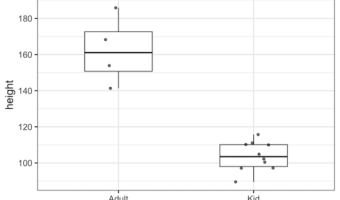
Boxplots with data points are a great way to visualize multiple distributions at the same time without losing any information about the data. In this tutorial, we will see examples of making Boxplots with data points using ggplot2 in R and customize the boxplots with data … [Read more...] about How To Make Boxplots with Data Points in R using ggplot2?

Filed Under: Boxplot ggplot2, R Tagged With: ggplot2, R

How to Make Boxplots with ggplot2 in R?

datavizpyr · December 20, 2019 ·

Adjust Boxplot Line Thickness: ggplot2

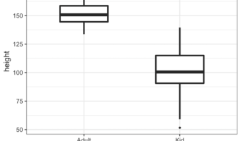
A boxplot is one of the simplest ways to summarize and visualize a distribution. Boxplots have been around for close to 50 years. The earliest form of Boxplot was invented by Mary Eleanor Spear as range plot and then John Tukey created box-and-whisker plot that uses quartiles of … [Read more...] about How to Make Boxplots with ggplot2 in R?

Filed Under: Boxplot ggplot2, R Tagged With: ggplot2, R

  • « Go to Previous Page
  • Page 1
  • Page 2

Primary Sidebar

Python & R Viz Hubs

  • Seaborn Guide & Cookbook
  • ggplot2 Guide & Cookbook
  • Matplotlib Guide & Cookbook
  • Confusion Matrix Calculator
  • Visualizing Activation Functions
  • Visualizing Dropout
  • Visualizing Loss Functions

Buy Me a Coffee

Copyright © 2026 · Daily Dish Pro on Genesis Framework · WordPress · Log in

Go to mobile version