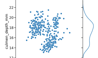
In this tutorial, we will use Seaborn and learn how to make a scatterplot between two quantitative variables with marginal density plots on the sides. We will use Seaborn's JointGrid() to define the features of the plot and then add scatter plot on top first and then add … [Read more...] about How to Make Scatterplot with Marginal Density Plots with Seaborn
Seaborn
How To Make Scatterplot with marginal boxplots with Seaborn ?
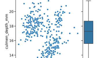
In this post, we will learn how to make a scatterplot with marginal boxplots using Seaborn in Python. To make a scatterplot we will use some of Seaborn's powerful but not very well known functionalities. More specifically, we will use Seaborn's JointGrid() to set up the plot … [Read more...] about How To Make Scatterplot with marginal boxplots with Seaborn ?
How to Make Histograms with Density Plots with Seaborn histplot?

In this tutorial, we will see how to make a histogram with a density line using Seaborn in Python. With Seaborn version 0.11.0, we have a new function histplot() to make histograms. Here, we will learn how to use Seaborn's histplot() to make a histogram with density line … [Read more...] about How to Make Histograms with Density Plots with Seaborn histplot?
How to Make ECDF plot with Seaborn in Python?
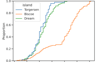
ECDF plot, aka, Empirical Cumulative Density Function plot is one of the ways to visualize one or more distributions. In this post, we will learn how to make ECDF plot using Seaborn in Python. Till recently, we have to make ECDF plot from scratch and there was no out of the … [Read more...] about How to Make ECDF plot with Seaborn in Python?
Seaborn set_context() to adjust size of plot labels and lines
One of the challenges in making data visualization is making all aspects of a plot clearly visible. Often, you might see where the axis labels, tick labels are too small and not legible at all. Challenge is that the required sizes of plot aspects like labels, points, lines are … [Read more...] about Seaborn set_context() to adjust size of plot labels and lines