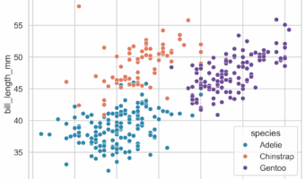
Seaborn picks sensible default colors when you map a variable to hue, but real projects often need more control—consistent brand colors across plots, color-blind–friendly choices, or publication-ready figures. This hands-on tutorial shows exactly how to change colors in Seaborn, … [Read more...] about How to Change Colors in Seaborn (Custom Palettes and Manual Colors)
Python
How to Customize Titles in Multi-Panel plots with Seaborn?
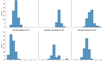
Multi-panel plots or small multiples are a great way visualize the relationship between two variables with respect ot the values of other variables. Seaborn offers a few different ways to make a multi-panel plots, with FacetGrid is the class behind multi-panel plots in … [Read more...] about How to Customize Titles in Multi-Panel plots with Seaborn?
Pandas Bootstrap_plot(): Understand uncertainty
One of the key parts of data analysis is to use summary statistics to understand the trend in the data. Understanding the variability in such summary statistics can be extremely useful to put weight on such summary statistics. Bootstrapping, resampling data with replacement is an … [Read more...] about Pandas Bootstrap_plot(): Understand uncertainty
Grouped Boxplot with Jittered Points with Seaborn Python

Grouped boxplots help us visualize the relationship between three variables, two categorical variables and one quantitative variable. When we make a boxplot, it is always a good idea to add the original data points on top of the boxplot, when possible. In this post, we will learn … [Read more...] about Grouped Boxplot with Jittered Points with Seaborn Python
How To Change Edge Color on Seaborn Scatter Plot?
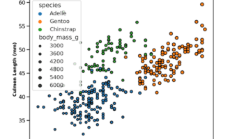
Seaborn's scatterplot function allows us to make compelling scatter plots easily. In this post we will learn how to customize edge color of a scatter plot made with Seaborn. By default, Seaborn's scatter plot function colors the markers edge color to be white. In this post, … [Read more...] about How To Change Edge Color on Seaborn Scatter Plot?