• Skip to primary navigation
  • Skip to main content
  • Skip to primary sidebar

Data Viz with Python and R

Learn to Make Plots in Python and R

  • Home
  • Python Viz
  • Seaborn
  • Altair
  • R Viz
  • ggplot2
  • About
    • Privacy Policy
  • Show Search
Hide Search

highlight time range in timeseries plot

How To Highlight a Time Range in Time Series Plot in Python with Matplotlib?

datavizpyr · March 30, 2020 ·

Highlight a Time Range Over Time Series Plot in Python

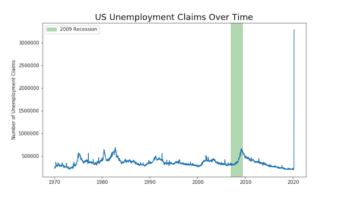
Time Series Plots are line plots with x-axis being date time instead of regular quantitative or ordered categorical variable. Sometimes you might want to highlight a region on a time series plot. In this post, we will learn how to highlight a time interval with a rectangular … [Read more...] about How To Highlight a Time Range in Time Series Plot in Python with Matplotlib?

Filed Under: highlight time range in timeseries plot, Python Tagged With: Matplotlib, Python

Primary Sidebar

Tags

Altair barplot Boxplot boxplot python boxplot with jiitered text labels Bubble Plot Color Palette Countplot Density Plot Facet Plot gganimate ggplot2 ggplot2 Boxplot ggplot2 error ggplot boxplot ggridges ggtext element_markdown() Grouped Barplot R heatmap heatmaps Histogram Histograms Horizontal boxplot Python lollipop plot Maps Matplotlib Pandas patchwork pheatmap Pyhon Python R RColorBrewer reorder boxplot ggplot Ridgeline plot Scatter Plot Scatter Plot Altair Seaborn Seaborn Boxplot Stock Price Over Time Stripplot UpSetR Violinplot Violin Plot World Map ggplot2

Buy Me a Coffee

Copyright © 2025 · Daily Dish Pro on Genesis Framework · WordPress · Log in

Go to mobile version