• Skip to primary navigation
  • Skip to main content
  • Skip to primary sidebar

Data Viz with Python and R

Learn to Make Plots in Python and R

  • Home
  • Python Viz
  • Seaborn
  • Altair
  • R Viz
  • ggplot2
  • About
    • Privacy Policy
  • Show Search
Hide Search

ggplot2

How To Connect Paired Points with Lines in Scatterplot in ggplot2?

datavizpyr · June 17, 2020 ·

Scatter plot with Paired points Connected by Arrow ggplot2

Scatter plots are a great way to visualize the trend between two quantitative variables. Sometimes, you may have paired quantitative variables and would like to see the how the pairs are related. For example you may have two quantitative variables corresponding to two different … [Read more...] about How To Connect Paired Points with Lines in Scatterplot in ggplot2?

Filed Under: ggplot2 Connect Paired Points, R Tagged With: connect paired points with lines, Scatter Plot

How To Adjust Legend Position in ggplot2?

datavizpyr · June 15, 2020 ·

ggplot2 legend on top of a plot

Legends are useful to add additional variables to a data visualization. By default, when we make a plot with legend using ggplot2, it places the legend on outside the plot on the right side. In this post, we will learn how to change or adjust the legend position in ggplot2. We … [Read more...] about How To Adjust Legend Position in ggplot2?

Filed Under: adjust legend position ggplot2, ggplot2, R Tagged With: ggplot2, R

How To Show Mean Value in Boxplots with ggplot2?

datavizpyr · June 10, 2020 ·

Customizing Mean mark to boxplot with ggplot2

Boxplots are a great way to visualize multiple distributions using summary statistics. Boxplot shows five summary statistics; the minimum, the maximum, the median, and the first and third quartiles of the data. Sometimes, you might want to add other statistical summary values on … [Read more...] about How To Show Mean Value in Boxplots with ggplot2?

Filed Under: ggplot2, mean in boxplot, R Tagged With: Boxplot, ggplot2, R

How to Connect Data Points on Boxplot with Lines?

datavizpyr · June 8, 2020 ·

Connect Paired data points boxplot

Boxplots with data points are great way to visualize the summary information between distributions and also look at the actual data points. Sometimes, when making boxplot with paired data points, it is also useful to connect the paired data points with lines. Adding lines to … [Read more...] about How to Connect Data Points on Boxplot with Lines?

Filed Under: Connect points in boxplot, R Tagged With: Boxplot, ggplot2, R

How to Make ECDF Plot with ggplot2 in R?

datavizpyr · June 3, 2020 ·

ECDF plot of multiple distributions

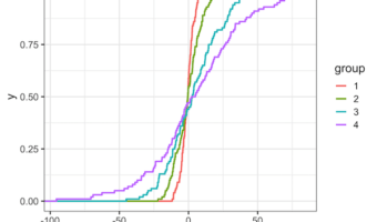
ECDF plot, a short for Empirical Cumulative Distribution Function Plot, is a great way to visualize one or more distributions. ECDF plot is a great alternative for histograms, as it does not suffer from the need of tuning parameter (bin size in histogram is a tuning parameter) … [Read more...] about How to Make ECDF Plot with ggplot2 in R?

Filed Under: ECDF plot, R Tagged With: ggplot2, R

  • « Go to Previous Page
  • Page 1
  • Interim pages omitted …
  • Page 21
  • Page 22
  • Page 23
  • Page 24
  • Page 25
  • Interim pages omitted …
  • Page 27
  • Go to Next Page »

Primary Sidebar

Tags

Altair barplot Boxplot boxplot python boxplot with jiitered text labels Bubble Plot Color Palette Countplot Density Plot Facet Plot gganimate ggplot2 ggplot2 Boxplot ggplot2 error ggplot boxplot ggridges ggtext element_markdown() Grouped Barplot R heatmap heatmaps Histogram Histograms Horizontal boxplot Python lollipop plot Maps Matplotlib Pandas patchwork pheatmap Pyhon Python R RColorBrewer reorder boxplot ggplot Ridgeline plot Scatter Plot Scatter Plot Altair Seaborn Seaborn Boxplot Stock Price Over Time Stripplot UpSetR Violinplot Violin Plot World Map ggplot2

Buy Me a Coffee

Copyright © 2025 · Daily Dish Pro on Genesis Framework · WordPress · Log in

Go to mobile version