• Skip to primary navigation
  • Skip to main content
  • Skip to primary sidebar

Data Viz with Python and R

Learn to Make Plots in Python and R

  • Home
  • Python Viz
  • Seaborn
  • Altair
  • R Viz
  • ggplot2
  • About
    • Privacy Policy
  • Show Search
Hide Search

ggplot2

How To Add Regression Line per Group to Scatterplot in ggplot2?

datavizpyr · July 11, 2020 ·

Add regression line per group without SE to scatterplot ggplot2.

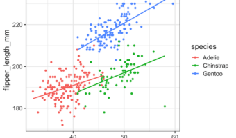
In this tutorial, we will learn how to add regression lines per group to scatterplot in R using ggplot2. In ggplot2, we can add regression lines using geom_smooth() function as additional layer to an existing ggplot2. We will first start with adding a single regression to the … [Read more...] about How To Add Regression Line per Group to Scatterplot in ggplot2?

Filed Under: ggplot2, R, regression line per group Tagged With: ggplot2, R

How To Make Grouped Violinplot with ggplot2 in R?

datavizpyr · July 6, 2020 ·

Grouped Violin plot with ggplot2

In this tutorial, we will see examples of how to make grouped violinplots using ggplot2's geom_violin() function. Violinplots are like boxplot for visualizing numerical distributions for multiple groups. In comparison to boxplot, Violin plot adds information about density of … [Read more...] about How To Make Grouped Violinplot with ggplot2 in R?

Filed Under: ggplot2, Grouped Violinplot, R, Violin plot ggplot2 Tagged With: ggplot2, R, Violinplot

6 ggplot2 themes to make your plot look better

datavizpyr · July 1, 2020 ·

ggplot2 theme_bw() with basesize 16

ggplot2 themes offer a great ways to change the look of a plot easily. ggplot2's theme() function lets you control all aspects of the themes in general. However, ggplot2 has multiple built in themes that are ready to use. In tutorial, we will see examples of 6 ggplot2 themes that … [Read more...] about 6 ggplot2 themes to make your plot look better

Filed Under: ggplot2, ggplot2 themes Tagged With: ggplot2, R

How To Place Legend Inside the Plot with ggplot2?

datavizpyr · June 24, 2020 ·

Customizing Legend Inside Scatter Plot ggplot2

By default, when we make a plot with legend using ggplot2, it places the legend outside of the plot on the right side. Sometimes one might want to place the legend inside the plot. One of the advantages of placing it inside is that we may gain additional space for the plot. In … [Read more...] about How To Place Legend Inside the Plot with ggplot2?

Filed Under: ggplot2, R Tagged With: ggplot2 move legend to inside

How To Add Labels to Grouped Barplot with Bars Side-By-Side in R?

datavizpyr · June 19, 2020 ·

Customizing Labels on Bars in Side by side Stacked Barplot

In this post we will learn how to add labels to bars on barplot that is stacked side-by-side. We will start with making side-by-side grouped barplot and work our way through adding annotation on top of each bar of the stacked barplot. Adding annotation to grouped barplot with … [Read more...] about How To Add Labels to Grouped Barplot with Bars Side-By-Side in R?

Filed Under: add labels to grouped barplot, ggplot2, R Tagged With: barplot, ggplot2, Grouped Barplot R, R

  • « Go to Previous Page
  • Page 1
  • Interim pages omitted …
  • Page 20
  • Page 21
  • Page 22
  • Page 23
  • Page 24
  • Interim pages omitted …
  • Page 27
  • Go to Next Page »

Primary Sidebar

Tags

Altair barplot Boxplot boxplot python boxplot with jiitered text labels Bubble Plot Color Palette Countplot Density Plot Facet Plot gganimate ggplot2 ggplot2 Boxplot ggplot2 error ggplot boxplot ggridges ggtext element_markdown() Grouped Barplot R heatmap heatmaps Histogram Histograms Horizontal boxplot Python lollipop plot Maps Matplotlib Pandas patchwork pheatmap Pyhon Python R RColorBrewer reorder boxplot ggplot Ridgeline plot Scatter Plot Scatter Plot Altair Seaborn Seaborn Boxplot Stock Price Over Time Stripplot UpSetR Violinplot Violin Plot World Map ggplot2

Buy Me a Coffee

Copyright © 2025 · Daily Dish Pro on Genesis Framework · WordPress · Log in

Go to mobile version