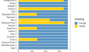
One of the common data exploring activities is to quickly have an understanding of the exten of missing data in a data set. There are a few quick ways to make a visualization of missing data. In this tutorial we will learn how to make stacked barplot with counts and proportion of … [Read more...] about Visualizing Missing Data with Barplot in R
ggplot2
How to Make Grouped Barplots with Same Bar Width

Grouped barplot allows to show third categorical variable in the barplot. Sometimes, when we make grouped barplot using ggplot2, some of the bars would have much broader width sizes. We typically get bars with uneven widths in a grouped barplot when some of the groups don't have … [Read more...] about How to Make Grouped Barplots with Same Bar Width
How To Fold Legend into Multiple Rows in ggplot2
Sometimes when we make a plot with a legend either on top or bottom, it may be too long. In this post, we will learn to fold the long legend into two or more rows (or columns) with ggplot2 in R. Example plot with long legend that needs to be wrapped into two rows We … [Read more...] about How To Fold Legend into Multiple Rows in ggplot2
How to Add Labels Directly in ggplot2. Hint: Use Secondary Axis Trick

Legends can be of great help to understand a plot. Typically, ggplot2 adds legend by default on right side of the plot based on the variable that we used to color or fill. However, as Cluas Wilke says in his fantastic book on Data Visualization, legends can make the plot … [Read more...] about How to Add Labels Directly in ggplot2. Hint: Use Secondary Axis Trick
How To Customize Border in facet in ggplot2
ggplot2's facet options are a great way make small multiples, i.e. multiple plots of the same type in a panel or grid. In this post, we will learn how to control the border line in a plot made with facet_wrap() function in ggplot2. First we will see how to remove the border … [Read more...] about How To Customize Border in facet in ggplot2