Boxplots with data points are a great way to visualize multiple distributions at the same time without losing any information about the data.
In this tutorial, we will see examples of making Boxplots with data points using ggplot2 in R and customize the boxplots with data points.
Let us load all the packages in tidyverse in R.
library(tidyverse)
We will make boxplots with data points using simulated data. Let us simulate some random data and store them in a tibble, another form of dataframe.
set.seed(23)
# number of data points in our data
n1 <- 4
n2 <- 10
# dataframe/tibble with data for boxplots with data points
df <- tibble(height = c(rnorm(n1, mean=150, sd=20),
                        rnorm(n2, mean=100, sd=20) ),
             age_group = c(rep("Adult", n1),
                           rep("Kid", n2)))
Our dataframe contains two variables.
head(df)
## # A tibble: 6 x 2
##   height age_group
##    <dbl> <chr>
## 1   154. Adult
## 2   141. Adult
## 3   168. Adult
## 4   186. Adult
## 5   120. Kid
## 6   122. Kid
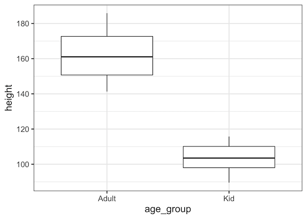
Let us make a simple boxplot with the data using ggplot2. In this example we use pipe operator to provide data to ggplot2 function.
df %>% ggplot(aes(x=age_group, y=height)) +
  geom_boxplot() +
  theme_bw(base_size=16)
We can also make a boxplot without the pipe operator as well. To do that we use ggplot(df, aes(….)). This is how the simple boxplot looks like. On the y axis we have height and on the x-axis we have the two values corresponding to categorical variable “age_group”
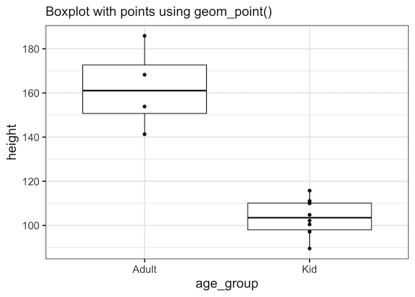
A naive way to add the actual data points is to simply use geom_point() and add it to our existing code for making boxplot. In the code example below, we have also added a subtitle using labs() function in ggplot2.
df %>% ggplot(aes(x=age_group, y=height)) +
  geom_boxplot() +
  geom_point()+
  labs(subtitle="Boxplot with points using geom_point()")+
  theme_bw(base_size=16)
Now we do have a boxplot with data points overlayed on the boxes. However, the geom_point() function simply adds the points along a line. If we have multiple data points with same value, they will all overlap on each other.
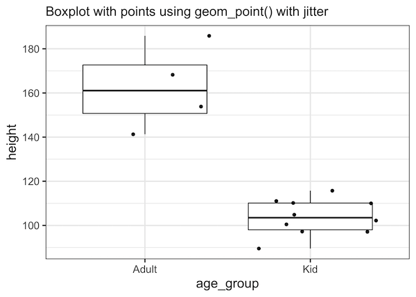
A better way to make boxplot with data points is to add a little bit of random noise so that the data points do not completely overlap. Adding some random noise is also called jittering.
We will see two example of adding jitters, i.e. adding random noise to data points for visualization. In the first example, we will use geom_point() function and provide the position=”jitter” argument that adds jitter to data points.
df %>% ggplot(aes(x=age_group, y=height)) +
  geom_boxplot() +
  geom_point(position = jitter)+
  labs(subtitle="Boxplot with points using geom_point() with jitter")+
  theme_bw(base_size=16)
Now we have a boxplot with data points on it, but with a small random noise added to it.
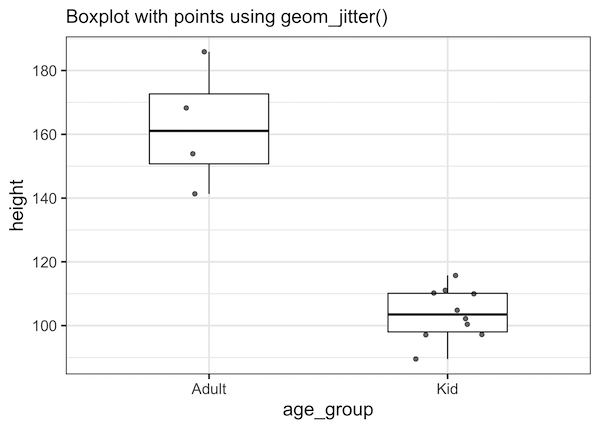
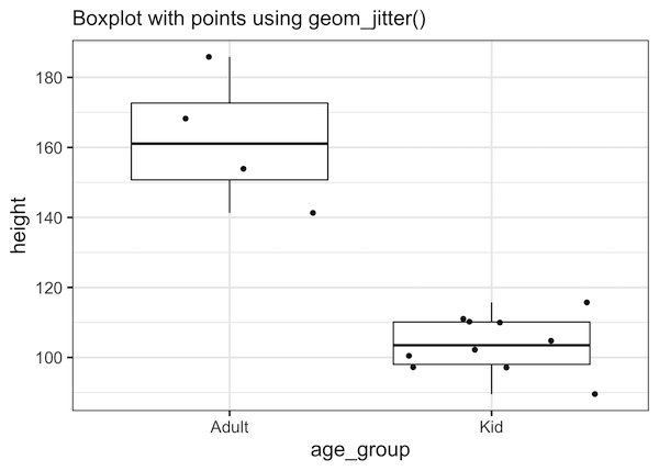
Another easier way to add data points to a boxplot is to use geom_jitter() function instead of geom_point() function.
df %>% ggplot(aes(x=age_group, y=height)) +
  geom_boxplot() +
  geom_jitter()+
  labs(subtitle="Boxplot with points using geom_jitter()")+
  theme_bw(base_size=16)
geom_jitter() function is a convenient wrapper function for “geom_point(position = jitter)” that adds a small amount of random noise to each point to avoid overplotting. And we get a similar boxplot with data points jittered around.
One of the challenges when we add data points to a boxplot is that we need to make sure the sizes of boxplot and jitter width fits nicely to help the plot.
A couple of tips to make sure the boxplot with jittered data points look good is
* reduce the width of boxes in box
* make the width of the jitter smaller than width of the boxes
We can change the width of boxplot with the argument “width”. Similarly we can change the width of jitter with width argument as below.
df %>% ggplot(aes(x=age_group, y=height)) +
  geom_boxplot(width=0.5) +
  geom_jitter(alpha=0.6, width=0.15)+
  labs(subtitle="Boxplot with points using geom_jitter()")+
  theme_bw(base_size=16)
Now our boxplot with the jittered data points looks much better that what we started.