• Skip to primary navigation
  • Skip to main content
  • Skip to primary sidebar

Data Viz with Python and R

Learn to Make Plots in Python and R

  • Home
  • Python Viz
  • Seaborn
  • Altair
  • R Viz
  • ggplot2
  • About
    • Privacy Policy
  • Show Search
Hide Search

How To Make Boxplots in base R?

datavizpyr · April 6, 2020 ·

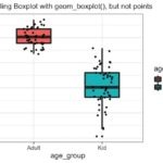
In this post, we will learn how to make simple boxplots using base R function boxplot(). We will use mtcars dataset available readily in R to first make a simple boxplot using boxplot() function in base R. And then we will learn how to customize the boxplot with specifying x and y-axis labels. Finally, we will see an example of how to manually add color to fill the boxes in boxplot.

 
head(mtcars)
 
##                    mpg cyl disp  hp drat    wt  qsec vs am gear carb
## Mazda RX4         21.0   6  160 110 3.90 2.620 16.46  0  1    4    4
## Mazda RX4 Wag     21.0   6  160 110 3.90 2.875 17.02  0  1    4    4
## Datsun 710        22.8   4  108  93 3.85 2.320 18.61  1  1    4    1
## Hornet 4 Drive    21.4   6  258 110 3.08 3.215 19.44  1  0    3    1
## Hornet Sportabout 18.7   8  360 175 3.15 3.440 17.02  0  0    3    2
## Valiant           18.1   6  225 105 2.76 3.460 20.22  1  0    3    1

We will see how mow to make simple boxplot between Miles per Gallon and the number of cylinders in mtcars data set. We use boxplot() function with the variables of interest as mpg ~ cyl and specify the data set.

 
boxplot(mpg ~ cyl, 
        data=mtcars)

We get the basic boxplot using base R.

Simple Boxplot in Base R

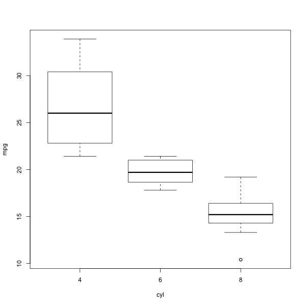
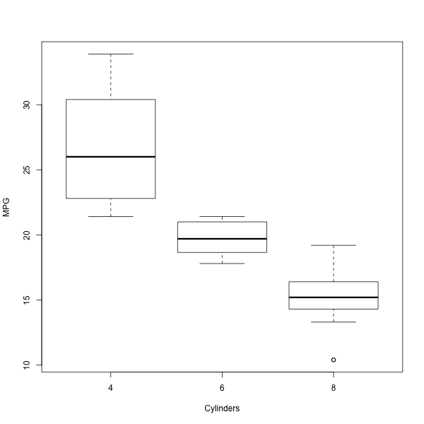
The boxplot looks pretty minimal. Let us add x-axis and y-axis labels using xlab and ylab.

 
boxplot(mpg ~ cyl, 
        data=mtcars, 
        xlab="Cylinders", ylab="MPG")

Now we have customized our bxplot with axis labels.

Add X and Y-axis Labels to boxplot
Add Labels to boxplot in base R

Let us learn how to add colors to fill the boxes. We can use “col” argument with colors of interest to fill boxes with colors.

 
boxplot(mpg ~ cyl, 
        data=mtcars, 
        xlab="Cylinders", ylab="MPG", col="steelblue")
Add Colors to boxplot in base R

Related posts:

Filling boxplot with colors using geom_boxplot()How To Color Boxplots By a Variable in R with ggplot2? Connect Paired data points boxplotHow to Connect Data Points on Boxplot with Lines? Customizing Mean mark to boxplot with ggplot2How To Show Mean Value in Boxplots with ggplot2? How to Make Heatmap with ggplot2?How To Make Simple Heatmaps with ggplot2 in R?

Filed Under: base R Boxplot, R Tagged With: Boxplot, R

Primary Sidebar

Tags

Altair barplot Boxplot boxplot python boxplot with jiitered text labels Bubble Plot Color Palette Countplot Density Plot Facet Plot gganimate ggplot2 ggplot2 Boxplot ggplot2 error ggplot boxplot ggridges ggtext element_markdown() Grouped Barplot R heatmap heatmaps Histogram Histograms Horizontal boxplot Python lollipop plot Maps Matplotlib Pandas patchwork pheatmap Pyhon Python R RColorBrewer reorder boxplot ggplot Ridgeline plot Scatter Plot Scatter Plot Altair Seaborn Seaborn Boxplot Stock Price Over Time Stripplot UpSetR Violinplot Violin Plot World Map ggplot2

Buy Me a Coffee

Copyright © 2025 · Daily Dish Pro on Genesis Framework · WordPress · Log in

Go to mobile version