• Skip to primary navigation
  • Skip to main content
  • Skip to primary sidebar

Data Viz with Python and R

Learn to Make Plots in Python and R

  • Home
  • Python Viz
  • Seaborn
  • Altair
  • R Viz
  • ggplot2
  • About
    • Privacy Policy
  • Show Search
Hide Search

datavizpyr

How To Make Grouped Barplots in Python with Seaborn?

datavizpyr · February 4, 2020 ·

Grouped Barplot with Seaborn

In this tutorial, we will see examples of how to make grouped barplots using Seaborn in Python. Barcharts are great when you have two variables one is numerical and the other is a categorical variable. A barplot can reveal the relationship between them. A Grouped barplot is … [Read more...] about How To Make Grouped Barplots in Python with Seaborn?

Filed Under: Grouped Barplot Seaborn, Python, Seaborn Tagged With: Python, Seaborn

How To Make Title Bold in ggplot2?

datavizpyr · February 3, 2020 ·

ggplot: increase title size

One of the common failures of making a data visualization is wither not having a title for plot or having a title that is not easy to read. Making the title in bold can help making the visualiation better. In this post, we will learn how to make the title of plot made with ggplot … [Read more...] about How To Make Title Bold in ggplot2?

Filed Under: make title bold ggplot2, R Tagged With: ggplot2, R

How To Remove X Axis Tick and Axis Text with ggplot2 in R?

datavizpyr · January 31, 2020 ·

A plot without x-axis tick and x-axis Text in ggplot2

Sometimes when you make a plot in R you might want the plot without ticks and text on axis. In this tutorial, we will learn how to remove x-axis or y-axis ticks and the text in R with ggplot2. Let us first load tidyverse, a suite of R packages from RStudio. Let us also load … [Read more...] about How To Remove X Axis Tick and Axis Text with ggplot2 in R?

Filed Under: ggplot2, R, remove axis tick and text Tagged With: ggplot2, R

Grouped Boxplots in Python with Seaborn

datavizpyr · January 30, 2020 ·

Grouped Boxplot in Python with Seaborn

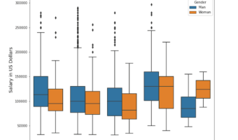
In this post, we will learn how to make grouped boxplots in Python using Seaborn's boxplot function. Grouped boxplots are a great way to visualize when you have three variables, where one of them is a numerical variable and the other two are categorical variables. Let us load … [Read more...] about Grouped Boxplots in Python with Seaborn

Filed Under: Grouped Boxplot Seaborn, Python, Seaborn Boxplot Tagged With: Boxplot, Python, Seaborn

How To Make Lollipop Plot in R with ggplot2?

datavizpyr · January 29, 2020 ·

Reordered Lollipop Chart in R

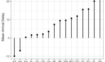
In this post, we will learn how to make lollipop plots in using R. Lollipop plots or lollipop charts kid of related to barplots or scatter plot when one of the variables is categorical variable. We will use NYC flights data from nycflights13 R package. Let us load tidyverse … [Read more...] about How To Make Lollipop Plot in R with ggplot2?

Filed Under: lollipop plot in R, R Tagged With: ggplot2, lollipop plot, R

  • « Go to Previous Page
  • Page 1
  • Interim pages omitted …
  • Page 43
  • Page 44
  • Page 45
  • Page 46
  • Page 47
  • Interim pages omitted …
  • Page 54
  • Go to Next Page »

Primary Sidebar

Tags

Altair barplot Boxplot boxplot python boxplot with jiitered text labels Bubble Plot Color Palette Countplot Density Plot Facet Plot gganimate ggplot2 ggplot2 Boxplot ggplot2 error ggplot boxplot ggridges ggtext element_markdown() Grouped Barplot R heatmap heatmaps Histogram Histograms Horizontal boxplot Python lollipop plot Maps Matplotlib Pandas patchwork pheatmap Pyhon Python R RColorBrewer reorder boxplot ggplot Ridgeline plot Scatter Plot Scatter Plot Altair Seaborn Seaborn Boxplot Stock Price Over Time Stripplot UpSetR Violinplot Violin Plot World Map ggplot2

Buy Me a Coffee

Copyright © 2025 · Daily Dish Pro on Genesis Framework · WordPress · Log in

Go to mobile version