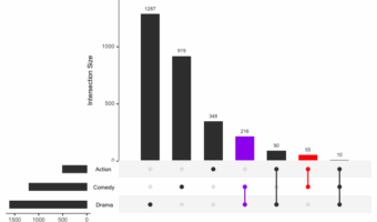
UpSet Plots in R with UpSetR: A Scalable Alternative to Venn Diagrams Venn diagrams work for up to three sets, but beyond that they become cluttered and hard to interpret. The UpSetR package solves this with UpSet plots, using a matrix layout plus bar charts to show … [Read more...] about Visualizing Intersection Sets with UpSet Plot: A Replacement for Venn Diagrams
How to Make Horizontal Violin Plot with Seaborn in Python?

In this tutorial, we will learn how to make horizontal violin plot in Seaborn with Python. With Seaborn, we can use two similar functions, catplot() and violinplot() to make violin plots. Making a violinplot horizontal with Seaborn is pretty simple. All we need to do is specify … [Read more...] about How to Make Horizontal Violin Plot with Seaborn in Python?
How to Add Dollar Symbol for Axis Labels with ggplot2?

This is a quick guide on how to add dollar signs ($) to your axis labels in ggplot2. We will use the label_dollar() function from the versatile scales package to handle the formatting. This function automatically adds the dollar prefix and inserts commas as thousands … [Read more...] about How to Add Dollar Symbol for Axis Labels with ggplot2?
Scatter Plot with Marginal Histograms in Python with Seaborn
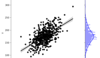
Sometimes when you make a scatter plot between two variables, it is also useful to have the distributions of each of the variables on the side as histograms. Scatter plots with marginal histograms on the side is a great way to do that. We can use Seaborn jointplot() function in … [Read more...] about Scatter Plot with Marginal Histograms in Python with Seaborn
How to Remove Legend in ggplot2

In this post, we will learn how to remove a legend from a plot made with ggplot2 in R. There are a few ways to remove legend in ggplot2. We will see examples using two functions in ggplot2 to remove legend from a plot. We will first use theme() function to remove legend in … [Read more...] about How to Remove Legend in ggplot2