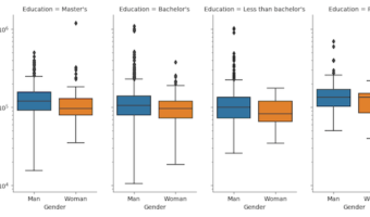
Facet plots, where one subsets the data based on a categorical variable and makes a series of similar plots with same scale is a great way to visualize when you have a numerical variable and a corresponding categorical variable. It is also known as small multiples as we make a … [Read more...] about How To Make Simple Facet Plots with Seaborn Catplot in Python?
How To Make Facet Plot using facet_wrap() in ggplot2?
When you have data for a variable corresponding to multiple groups, visualizing the data for each group can be useful. One of the techniques to use is to visualize data from multiple groups in a single plot. However, a better way visualize data from multiple groups is to use … [Read more...] about How To Make Facet Plot using facet_wrap() in ggplot2?
How To Adjust Title Position in ggplot2 ?

One of the annoying things while making a plot is fine tuning it the way you want. Sometimes ones of such pain points is placing the title on the plot. Till recently, ggplot2 placed title or subtitle such that it aligns with the plotting area. In this post we will learn how to … [Read more...] about How To Adjust Title Position in ggplot2 ?
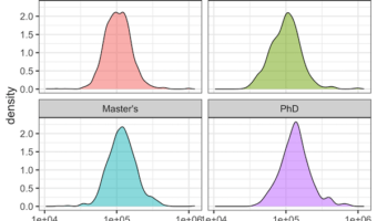
How To Make Density Plot in Python with Altair?

Density plots are like histogram, but displays density instead of counts. In this post, we will see a simple example of making a density plot in Python using Altair. Let us load Pandas and Altair to make density plot. We will use the tuition dataset from TidyTuesday … [Read more...] about How To Make Density Plot in Python with Altair?
How To Make Boxplots with Text as Points in R using ggplot2?
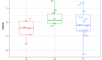
Boxplots with overlayed data points is a great way visualize multiple distributions. One of the biggest benefits of adding data points over the boxplot is that we can actually see the underlying data instead of just the summary stat level data visualization. Sometimes using text … [Read more...] about How To Make Boxplots with Text as Points in R using ggplot2?