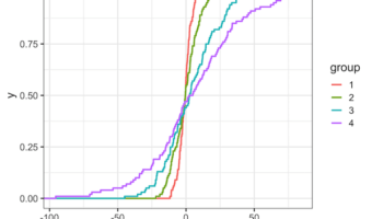
ECDF plot, a short for Empirical Cumulative Distribution Function Plot, is a great way to visualize one or more distributions. ECDF plot is a great alternative for histograms, as it does not suffer from the need of tuning parameter (bin size in histogram is a tuning parameter) … [Read more...] about How to Make ECDF Plot with ggplot2 in R?
ggpointdensity plot: A ggplot extension combining scatter plot with density plot
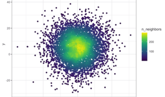
Scatterplots are great for visualizing relationship between two quantitative variables. However, it suffers from overplotting when the number of data points is large. Another solution is plot the density instead of actjual points. However, sometimes you might want to see the … [Read more...] about ggpointdensity plot: A ggplot extension combining scatter plot with density plot
How To Annotate Bars in Barplot with Matplotlib in Python?

In this post we will learn examples of adding text, annotating bars in barplot using matplotlib. We will make bar plots using Seaborn's barplot and use Matplotlib to add annotations to the bars in barplot. Let us load Pandas, Seaborn and Matplotlib. Let us create a toy … [Read more...] about How To Annotate Bars in Barplot with Matplotlib in Python?
How To Add Mean Line to Ridgeline Plot in R with ggridges?

In this post, we will learn how to add mean line to ridgeline plot. We can make ridgeline plot in R with ggridges R package developed Claus Wilke. Ridgeline plot is useful when you have multiple distributions or a distribution that changes in distributions over time or space. The … [Read more...] about How To Add Mean Line to Ridgeline Plot in R with ggridges?
How to Add Labels Over Each Bar in Barplot in R?

Adding text annotations over a barplot can be useful in quickly conveying the core message of a plot. In this post, we will see example of how to add text labels or text annotations over each bar in barplot. Barplot is great way to visualize numerical values corresponding to … [Read more...] about How to Add Labels Over Each Bar in Barplot in R?