
Violinplots are combination of boxplot and density plots. In this tutorial we will learn how to make Violinplots with Seaborn in Python and also show actual data points with violin plot. 👉 Want more? Explore the full Seaborn Tutorial Hub with 35+ examples, code recipes, and … [Read more...] about How To Make Violinpot with data points in Seaborn?
How To Change facet_wrap() Box Color in ggplot2?
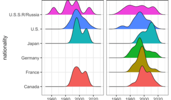
Facetting is a great way to show relationship between more than two variables. When you have three variables, with faceting one can splot a single plot into smaller plots with subset of data corresponding to the third variable. In ggplot2, we can easily make facetted plot using … [Read more...] about How To Change facet_wrap() Box Color in ggplot2?
How To Zoom in on a Plot in R?
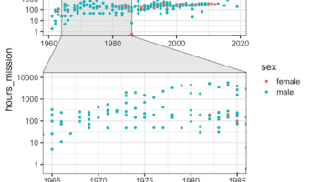
While making data visualization, often you might want show a bigger level picture and then zoom in on part of the plot. In this tutorial, we will see an example of how to zoom in on a part of plot made with ggplot2 in R. The package, ggforce, made by fantastic Thomas Lin … [Read more...] about How To Zoom in on a Plot in R?
Seaborn set_context() to adjust size of plot labels and lines
One of the challenges in making data visualization is making all aspects of a plot clearly visible. Often, you might see where the axis labels, tick labels are too small and not legible at all. Challenge is that the required sizes of plot aspects like labels, points, lines are … [Read more...] about Seaborn set_context() to adjust size of plot labels and lines
How To Add Regression Line per Group to Scatterplot in ggplot2?
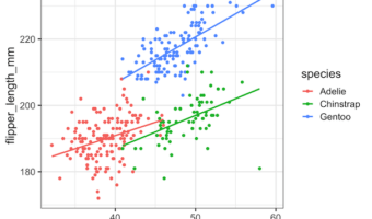
In this tutorial, we will learn how to add regression lines per group to scatterplot in R using ggplot2. In ggplot2, we can add regression lines using geom_smooth() function as additional layer to an existing ggplot2. We will first start with adding a single regression to the … [Read more...] about How To Add Regression Line per Group to Scatterplot in ggplot2?