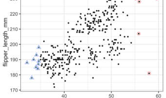
In this tutorial, we will learn how to add circles/triangles around a select data points in a scatter plot made with ggplot2 in R. Adding circles/triangles around data points is yet another way to add annotation to data points to highlight them to attract attention to the region … [Read more...] about How To Add Circles Around Specific Data Points in R
How to Annotate a Specific Cluster or Group in ggplot2
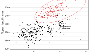
In this tutorial, we will learn how to annotate or highlight a specific cluster/group in R using ggplot2. We can use R package ggforce to annotate a select group as a circle or ellipse on a scatter plot. In this example, we will use geom_mark_ellipse() function to highlight a … [Read more...] about How to Annotate a Specific Cluster or Group in ggplot2
How To Annotate Clusters with Circle/Ellipse by a Variable in R
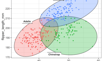
In this tutorial, we will learn how to annotate a plot by circle or ellipse based on a categorical variable in the data. We will use ggforce package's geom_mark_circle() and geom_mark_ellipse() functions to annotate with circles and ellipse. Unlike geom_circle() function to … [Read more...] about How To Annotate Clusters with Circle/Ellipse by a Variable in R
How To Annotate a Plot with Circle in R

In this tutorial, we will learn how to annotate a plot with circle to highlight a select portion of a plot made with ggplot2 in R. There are a few options to add a circle on top of a plot with ggplot2. In this example, we will annotate a plot with a circle at a specific location … [Read more...] about How To Annotate a Plot with Circle in R
How To Add Dollar Sign on Axis Ticks in Matplotlib

In this tutorial, we will see examples of how to add dollar sign on axis ticks while making plots with Matplotlib in Python. While making plots to understand the relationship between currency like US dollars and other variables, it is better to show the Dollar symbol/sign on the … [Read more...] about How To Add Dollar Sign on Axis Ticks in Matplotlib