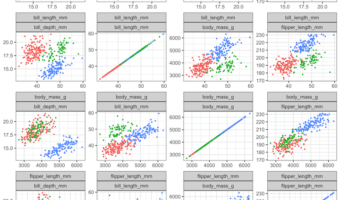
Pair plot is a simple way to quickly visualize the relationship between multiple variables in a dataframe. In this post, we will learn how to make a simple pair plot from scratch between a few quantitative/numerical variables using basic tidyverse functions. (H/T to a twitter … [Read more...] about Pair plot from scratch with tidyverse
How to Add Caption to a Plot in R

In this tutorial, we will learn how to add caption to a plot made with ggplot2 in R. Caption in R is a small text at the right corner of a plot that adds some value to the plot. We will use faithful eruption data available from built-in dataset in R. Simple plot … [Read more...] about How to Add Caption to a Plot in R
How to order boxes in boxplot with fct_reorder in R
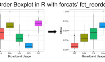
In this tutorial, we will learn how to order boxes in boxplot made with ggplot2 in R. There are a few ways to order boxes in a boxplot. Earlier, we saw how to use base R's reorder() function to order the boxes in boxplot based on the median values of another variable in the … [Read more...] about How to order boxes in boxplot with fct_reorder in R
How To Make tSNE plot in R
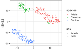
tSNE is dimensionality reduction technique suitable for visualizing high dimensional datasets. tSNE is an abbreviation of t-Distributed Stochastic Neighbor Embedding (t-SNE) and it was introduced by van der Maaten and Hinton. In this tutorial, we will learn how to perform tSNE in … [Read more...] about How To Make tSNE plot in R
pch in R : built-in shapes in R
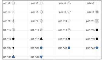
pch in R, short for plot characters, is symbols or shapes we can use for making plots. In R, there are 26 built in shapes available for use and they can be identified by numbers ranging from 0 to 25. The first 19 (0:18) numbers represent S-compatible vector symbols and the … [Read more...] about pch in R : built-in shapes in R