
In this post we will learn how to make a grouped boxplots with reproducible jittered points. We can make a grouped boxplot with jittered points using position_jitterdodge() function as position argument to geom_point(). Note that using the handy wrapper function … [Read more...] about Grouped Boxplots with reproducible jittered data points
How to Add Vertical/Horizontal Lines to Subplots with Seaborn

In this tutorial, we will learn how to add vertical or horizontal lines to "small multiples" i.e. multiple subplots of similar kind using Seaborn's refline() function (h/t to Chris Moffitt of @pbpython). Vertical/Horizontal lines are often useful to show where the mean or median … [Read more...] about How to Add Vertical/Horizontal Lines to Subplots with Seaborn
How to make random jittered points reproducible

In this post we will learn how to make a random jitter plots made with ggplot2 reproducible. We have multiple posts on the importance of showing the actual data points while making boxplots/violinplots. One of the ways to avoid overplotting, is to add random jitters on the x-axis … [Read more...] about How to make random jittered points reproducible
Direct Labeling on line plots with geomtextpath

Labeling a plot greatly help understand the gist of a plot easily. ggplot2 offers a number of ways to add text labels to a plot. Often directly adding the labels on a plot instead of having a legend is a better option. The R package, geomtextpath, a ggplot2 extension package … [Read more...] about Direct Labeling on line plots with geomtextpath
Remove Legend Title in ggplot2 (labs, guides, theme)
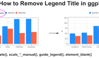
In this tutorial, you’ll learn four easy ways to remove legend titles in ggplot2 using scale_fill_discrete(), scale_fill_manual(), guides() with guide_legend(), and theme(legend.title = element_blank()). Each method works slightly differently depending on whether your legend … [Read more...] about Remove Legend Title in ggplot2 (labs, guides, theme)