In this tutorial, we will learn how to annotate a plot by circle or ellipse based on a categorical variable in the data. We will use ggforce package’s geom_mark_circle() and geom_mark_ellipse() functions to annotate with circles and ellipse. Unlike geom_circle() function to annotate a plot, geom_mark_* functions automatically computes the circle/ellipse radius to draw around the points in a group.
Let us load the packages needed. We will use Palmer penguin dataset to make a scatter plot and annotate it with a circle.
library(tidyverse)
library(palmerpenguins)
theme_set(theme_bw(16))
Here we remove any rows with missing data.
penguins <- penguins %>%
            drop_na()
penguins %>% head()
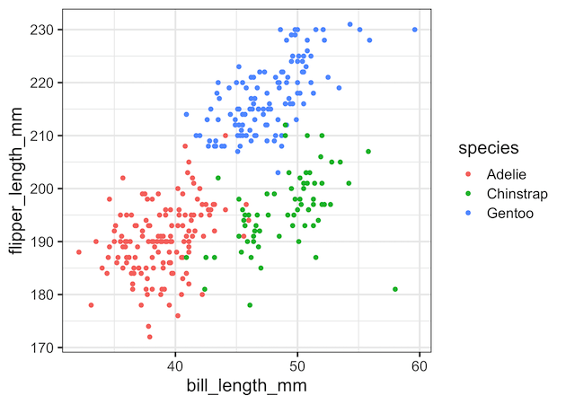
First, let make a scatterplot using ggplot2’s geom_point().
penguins %>%
  ggplot(aes(x = bill_length_mm,
             y = flipper_length_mm))+
  geom_point(aes(color = species))
ggsave("scatterplot_with_ggplot2.png")
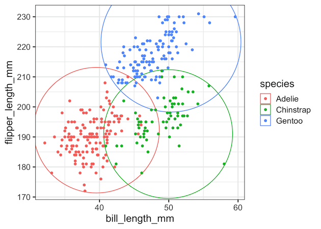
Annotate Groups in a scatterplot with circles using geom_mark_circle()
To add circles around cluster or data points belonging to groups, we can add geom_mark_circle() as additional layer. We have used color argument to color the circles based on the value of grouping variable.
penguins %>%
  ggplot(aes(x = bill_length_mm,
             y = flipper_length_mm))+
  geom_mark_circle(aes(color = species))+
  geom_point(aes(color = species))
ggsave("annotate_clusters_with_circles_ggforce.png")
Note that ggforce has automatically computed the circle radii for each value of the grouping variable and has drawn the circles.

We can customize the size of the circle little bit using “expand” argument to geom_mark_circle(). With expand option, we can see that the circle includes (and touches) the farthest data point for that group.
penguins %>%
  ggplot(aes(x = bill_length_mm,
             y = flipper_length_mm))+
  geom_mark_circle(aes(color=species),
                   expand = unit(0.5,"mm"))+
  geom_point(aes(color = species))
ggsave("annotate_clusters_with_circles_2_ggforce.png")
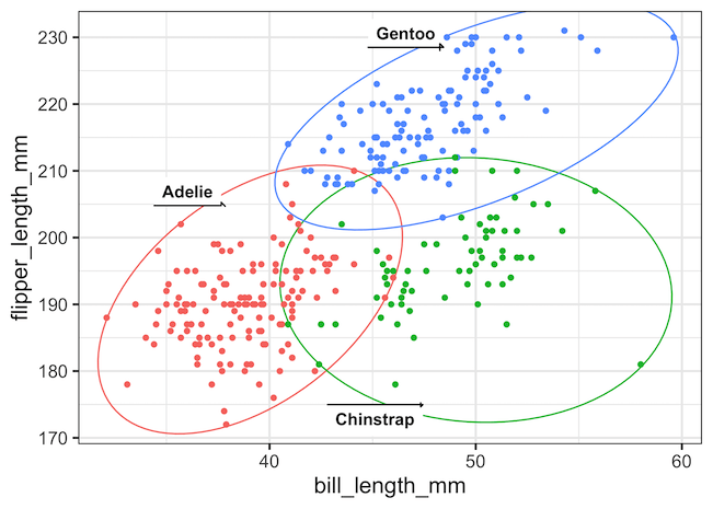
Annotate Groups in a scatterplot with ellipses using geom_mark_ellipse()
For this scatterplot annotating by circle does not seem like a that good fit. A better alternative is to annotate the groups by ellipse using ggforce’s geom_mark_ellipse() function. In this example, in addition to adding colors to ellipses, we also label the ellipses with group names. And we use “label.buffer” argument to adjust the location of the labels.
penguins %>%
  ggplot(aes(x = bill_length_mm,
             y = flipper_length_mm))+
  geom_mark_ellipse(aes(color = species,
                        label=species),
                    expand = unit(0.5,"mm"),
                    label.buffer = unit(-5, 'mm'))+
  geom_point(aes(color=species))+
  theme(legend.position = "none")
ggsave("annotate_groups_clusters_with_ellipse_ggplot2.png")
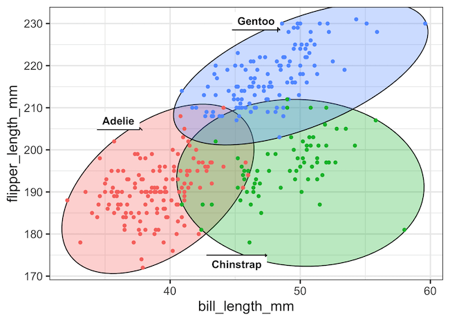
We can also use “fill” argument instead of “color” argument inside geom_mark_ellpse() function’s aes() to elevate the annotation with circles.
penguins %>%
  ggplot(aes(x = bill_length_mm,
             y = flipper_length_mm))+
  geom_mark_ellipse(aes(fill = species,
                        label = species),
                    expand = unit(0.5,"mm"),
                    label.buffer = unit(-5, 'mm'))+
  geom_point(aes(color = species))+
  theme(legend.position = "none")
ggsave("annotate_groups_clusters_with_ellipse_labels_fill_ggplot2.png")
Explore the Complete ggplot2 Guide
35+ tutorials with code: scatterplots, boxplots, themes, annotations, facets, and more—tested and beginner-friendly.
Visit the ggplot2 Hub → No fluff—just code and visuals.


