Annotating barplots with labels like texts or numerical values can be helpful to make the plot look better. Till now, one of the options add annotations in Matplotlib is to use pyplot’s annotate() function. Starting from Matplotlib version 3.4.2 and above, we have a new function, axes.bar_label() that lets you annotate barplots with labels easily.
In this tutorial, we will learn how to add labels to barplots using bar_label() function. As before, we will make barplots using Seaborn’s barplot() function, but add labels using Matplotlib’s bar_label() function.
Let us load Pandas, Seaborn and Matplotlib.
import pandas as pd
import seaborn as sns
import matplotlib.pyplot as plt
Let us create some data to make the barplot.
continent = ["Africa","Americas","Asia","Europe","Oceania"]
lifeExp=[49,65,60,72,74]
Our data for making barplot looks like this.
df = pd.DataFrame({"continent":continent, "lifeExp":lifeExp})
df
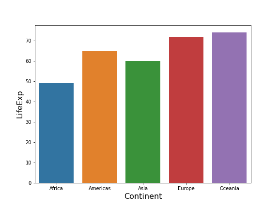
Let us make simple barplot with Seaborn’s barplot() function. Here we have customized the barplot’s labels with Matplotlib’s function xlabel and ylabel.
plt.figure(figsize=(8, 6))
splot=sns.barplot(x="continent",y="lifeExp",data=df)
plt.xlabel("Continent", size=16)
plt.ylabel("LifeExp", size=16)
plt.savefig("barplot_Seaborn_Python.png")
Labeling Barplots with Matplotlib’s bar_label() function
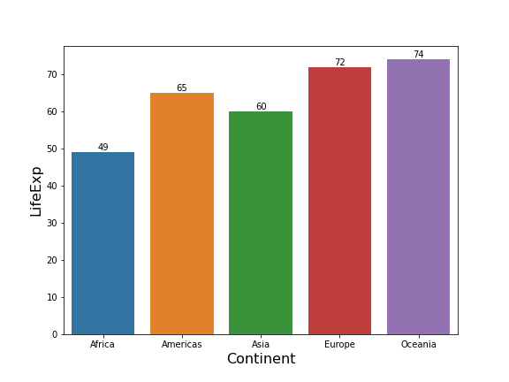
Similar to customizing the plot labels, now we can customize the bar labels using bar_label() function. Now, let us specify the bar labels using bar_label() function after making the barplot. Here we add bar height as bar labels to make it easy to read the barplot.
plt.figure(figsize=(8, 6))
splot=sns.barplot(x="continent",y="lifeExp",data=df)
plt.xlabel("Continent", size=16)
plt.ylabel("LifeExp", size=16)
plt.bar_label(splot.containers[0])
plt.savefig("annotate_barplot_with_Matplotlib_bar_label_Python.png")
Barplot function returns a bar container with all “artists” describing the barplot. Matplotlib’s bar_label() function takes a container as input to add labels/annotations to the barplot.
Customizing Barplot Labels with Matplotlib’s bar_label()
We can customize the label size using size argument to bar_label() function.
plt.figure(figsize=(8, 6))
splot=sns.barplot(x="continent",y="lifeExp",data=df)
plt.xlabel("Continent", size=16)
plt.ylabel("LifeExp", size=16)
plt.bar_label(splot.containers[0],size=16)
plt.savefig("annotate_barplot_with_Matplotlib_bar_label_change_size_Python.png")

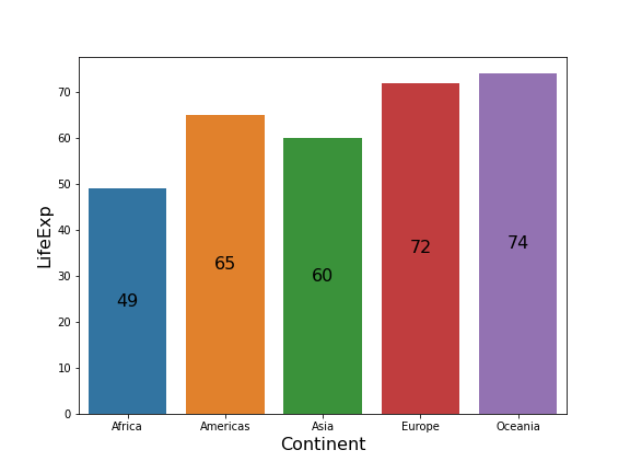
We can also place the bar label in the middle of the bars instead of at the bar edges using “label_type” argument.
plt.figure(figsize=(8, 6))
splot=sns.barplot(x="continent",y="lifeExp",data=df)
plt.xlabel("Continent", size=16)
plt.ylabel("LifeExp", size=16)
plt.bar_label(splot.containers[0],size=16,label_type='center')
plt.savefig("annotate_barplot_with_Matplotlib_bar_label_at_center_Python.png")