Adding text annotations to a plot can greatly help understanding a plot better. In this tutorial, we will learn couple of examples of adding text annotations to a scatter plot with three groups of samples. First we see couple of examples of what might typically go wrong while trying to add annotations with ggplot2. And then we will see an example of how to fix that problem.
Let us get started by loading the packages and data set needed to make the plot and add annotations.
Loading Packages and Dataset
library(tidyverse)
library(palmerpenguins)
theme_set(theme_bw(18))
penguins %>%
  head()

## # A tibble: 6 × 8
##   species island bill_length_mm bill_depth_mm flipper_length_… body_mass_g sex
##   <fct>   <fct>           <dbl>         <dbl>            <int>       <int> <fct>
## 1 Adelie  Torge…           39.1          18.7              181        3750 male
## 2 Adelie  Torge…           39.5          17.4              186        3800 fema…
## 3 Adelie  Torge…           40.3          18                195        3250 fema…
## 4 Adelie  Torge…           NA            NA                 NA          NA <NA>
## 5 Adelie  Torge…           36.7          19.3              193        3450 fema…
## 6 Adelie  Torge…           39.3          20.6              190        3650 male
## # … with 1 more variable: year <int>
Scatter plot with legend
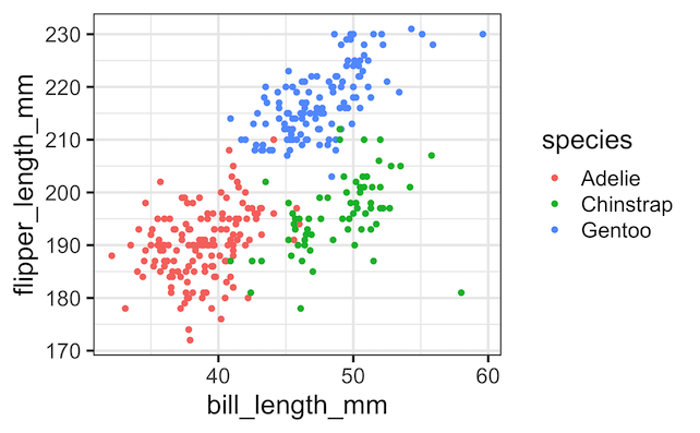
With ggplot2, we can easily color the groups of points and add legends to describe the groups as shown below.
penguins %>%
  ggplot(aes(x = bill_length_mm,
             y = flipper_length_mm,
             color = species))+
  geom_point()
ggsave("scatter_plot_with_legends_in_ggplot2.png")
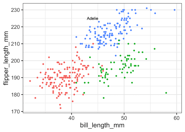
Pixelated Text Annotation while adding annotation with geom_text()
However, you may see that instead of the legends that is located separately from the plot area, it may be suitable to add the group names or simply highlight one of the group names right on the plot it self. We have a number different options to add such annotations in ggplot2.
One of the options to add annotation is to use geom_text() with x and y coordinates and the text label we want.
penguins %>%
  ggplot(aes(x = bill_length_mm,
             y = flipper_length_mm,
             color = species))+
  geom_point()+
  theme(legend.position="none")+
  geom_text(aes(x = 44, y = 225, label = "Adelie"), color="black")
ggsave("trouble_with_adding_text_annotation_geom_text.png")
At the first look, geom_text() function seems to have worked and added text annotation we needed. However at closer look we will find the text annotation is is pixelated and not crisp.
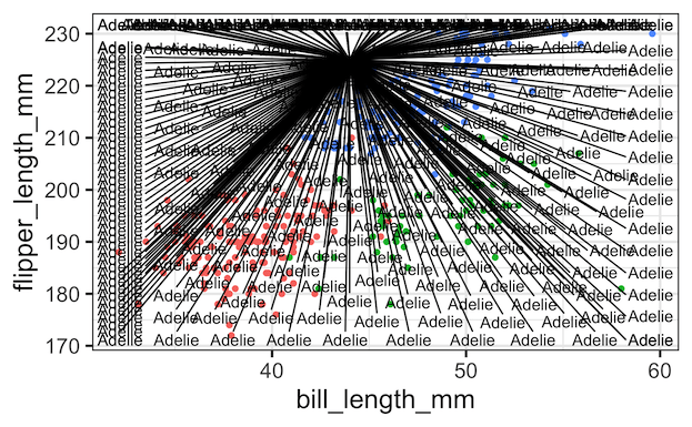
Illustrating the Annotation Problem with ggrepel’s geom_text_repel()
ggplot2’s geom_text() function is a useful function when we need to add text label for each data point in our dataset. In this example, we are interested adding a single text annotation. However, geom_text() adds the text label for all the rows in the data frame. That is the reason, we see pixelated text annotation on our plot.
We can see that clearly by using ggrepel’s geom_text_repel() function, which tries to separate all the text labels we provide.
library(ggrepel)
penguins %>%
  ggplot(aes(x = bill_length_mm,
             y = flipper_length_mm,
             color = species))+
  geom_point()+
  theme(legend.position="none")+
  geom_text_repel(aes(x=44, y=225, label="Adelie"), color="black")
ggsave("illustrating_trouble_with_adding_text_annotation_ggrepel.png")
This nicely illustrates the trouble or accident art we get when using geom_text_repel() with a single text.
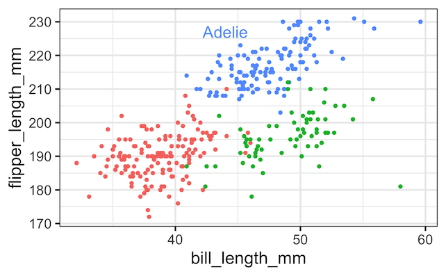
Adding Annotation with annotate() function
ggplot2 has annotate() function and it is useful for adding simple annotation on top of a plot. annoate()
function adds geoms to a plot, but unlike typical a geom function, the properties of the geoms are not mapped from variables of a data frame, but are instead passed in as vectors. This is useful for adding small annotations (such as text labels) or if you have your data in vectors, and for some reason don’t want to put them in a data frame.
In addition to x and y, annotate() function can take arguments that specifies text label, size and color. We customize the color of the annotated text to be the same color as the points on the scatterplot. Tip: We can find the color codes used by ggplot2 using hue_pal() function in scales package.
penguins %>%
  ggplot(aes(x = bill_length_mm,
             y = flipper_length_mm,
             color = species))+
  geom_point()+
  theme(legend.position="none")+
  annotate(geom="text",
           x=44, y=227,
           label="Adelie",
           size=6,
           color="#619CFF")
ggsave("Adding_text_annotation_with_annotate.png")
H/T to Kara Woo’s fantastic talk titled “Always look on the bright side of plots” at RStudio conference 2021 for the examples illustrated in the post. Watch the ~20 minutes talk to learn a ton.
Explore the Complete ggplot2 Guide
35+ tutorials with code: scatterplots, boxplots, themes, annotations, facets, and more—tested and beginner-friendly.
Visit the ggplot2 Hub → No fluff—just code and visuals.