Last updated on January 20, 2022
In this tutorial, we will learn how to add vertical or horizontal lines to “small multiples” i.e. multiple subplots of similar kind using Seaborn’s refline() function (h/t to Chris Moffitt of @pbpython). Vertical/Horizontal lines are often useful to show where the mean or median values of the variables of interest and in a simple plot we can use axvline/axhline to add the lines.
Let us get started with loading the packages needed.
import seaborn as sns
import matplotlib.pyplot as plt
We will use Palmer penguin dataset available from Seaborn’s built-in datasets.
penguins = sns.load_dataset("penguins")
Small multiples with Seaborn’s displot()
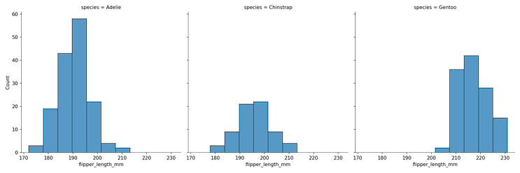
We can make a small multiple or facetted plot, in this example multiple histograms, using Seaborn’s displot() function with “col” argument. In this example, we are plotting the distributions of flipper lengths of different penguin species.
plt.figure(figsize=(12,6))
g = sns.displot(data = penguins,
               x = "flipper_length_mm",
               col = "species")
plt.savefig("Seaborn_small_multiples_With_displot.png",
                    format='png',dpi=150)
Seaborn’s refline() function to add horizontal/vertical lines in subplots
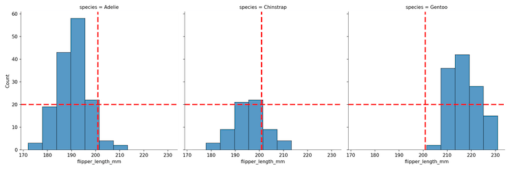
To add a horizontal and vertical line we can use Seaborn’s refline() function with x and y y co-ordinates for the locations of the horizontal and vertical lines.
plt.figure(figsize=(12,6))
g.refline(x = penguins.flipper_length_mm.mean(),
          y = 20,
          color = "red",
         lw = 3)
plt.savefig("Seaborn_small_multiples_refline_example.png",
                    format='png',dpi=150)
Here we have the small multiples with horizontal and vertical lines at the specified locations in “red” color”.
To add horizintal/vertical lines in different colors or different shapes, we can use two reflline() statements, one for horizontal and one for vertical lines as shown below.
g.refline(x=penguins.flipper_length_mm.mean(),
          color = "red",
          lw = 3)
g.refline(y = 20,
          color = "blue",
          lw = 3)
plt.savefig("Seaborn_small_multiples_refline_add_vertical_horizontal_lines.png",
                    format='png',dpi=150)

An additional plot of the similar flavor is to add the group specific horizontal or vertical lines instead of common ones. I may be wrong about it, but it does not look like Seaborn’s refline() can do that readily yet.


