Last updated on May 14, 2022
In this tutorial, we will learn how to add error values as labels on bars in a barplot. Thanks to @charliejhadley‘s nice tip showing how to add errors on barplot labels using str_glue() function. The main idea behind adding errors to labels is very similar to adding barplot heights as labels. In addition to the bar heights, we need to compute standard error and add that to the labels.
Let us get started by loading the packages needed.
library(tidyverse)
library(palmerpenguins)
theme_set(theme_bw(16))
We will use Palmer Penguin data set to make a barplot of mean values of flipper length first.
penguins %>% head()

## # A tibble: 6 × 8
##   species island bill_length_mm bill_depth_mm flipper_length_… body_mass_g sex
##   <fct>   <fct>           <dbl>         <dbl>            <int>       <int> <fct>
## 1 Adelie  Torge…           39.1          18.7              181        3750 male
## 2 Adelie  Torge…           39.5          17.4              186        3800 fema…
## 3 Adelie  Torge…           40.3          18                195        3250 fema…
## 4 Adelie  Torge…           NA            NA                 NA          NA <NA>
## 5 Adelie  Torge…           36.7          19.3              193        3450 fema…
## 6 Adelie  Torge…           39.3          20.6              190        3650 male
## # … with 1 more variable: year <int>
First, let us get started by getting the data needed to be plotted. We will use group_by() and summarize function to compute mean and the standard error values of mean flipper length in each island.
df <- penguins %>%
  group_by(island) %>%
  summarize(mean_flipper_length= mean(flipper_length_mm,
                                      na.rm=TRUE),
            sd_flipper_length = sd(flipper_length_mm,
                                   na.rm=TRUE))
Here is how the data for the barplot looks like.
df

## # A tibble: 3 × 3
##   island    mean_flipper_length sd_flipper_length
##   <fct>                   <dbl>             <dbl>
## 1 Biscoe                   210.             14.1
## 2 Dream                    193.              7.51
## 3 Torgersen                191.              6.23
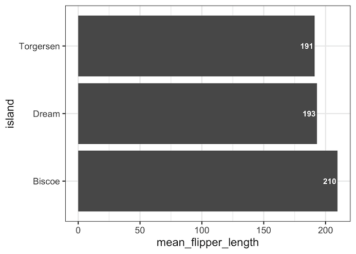
Barplot with bar heights as labels using str_glue() function
df %>%
  ggplot(aes(x = mean_flipper_length,
             y = island)) +
  geom_col() +
  geom_text(aes(label = str_glue("{round(mean_flipper_length)}")),
            color = "white",
            fontface = "bold",
            hjust = 1.1)
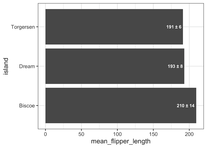
Barplot with mean and standard errors as labels using str_glue() function
df %>%
  ggplot(aes(x = mean_flipper_length,
             y = island)) +
  geom_col() +
  geom_text(aes(label = str_glue("{round(mean_flipper_length)} ± {round(sd_flipper_length)}")),
            color = "white",
            fontface = "bold",
            hjust = 1.1)
Explore the Complete ggplot2 Guide
35+ tutorials with code: scatterplots, boxplots, themes, annotations, facets, and more—tested and beginner-friendly.
Visit the ggplot2 Hub → No fluff—just code and visuals.

