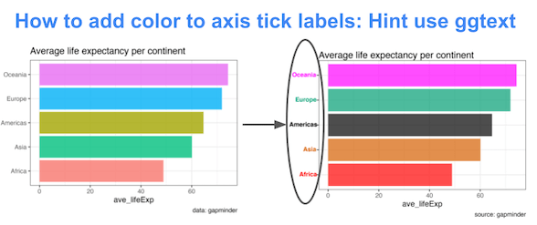
In this tutorial, we will learn about a nice ggplot2 trick/tip that enables colored text on axis tick labels. Thanks to new theme element element_markdown() in ggtext, R package developed by Claus Wilke, we can add colors to axis text labels.
To get started, let us load the packages needed. Here we use ggtext version 0.1.1.
library(tidyverse)
theme_set(theme_bw(16))
library(gapminder)
library(ggtext)
packageVersion("ggtext")

## [1] '0.1.1'
We will use gapminder data to make a barpot and show how to add colors to axis tick label.
gapminder %>%
  head()

## # A tibble: 6 × 6
##   country     continent  year lifeExp      pop gdpPercap
##   <fct>       <fct>     <int>   <dbl>    <int>     <dbl>
## 1 Afghanistan Asia       1952    28.8  8425333      779.
## 2 Afghanistan Asia       1957    30.3  9240934      821.
## 3 Afghanistan Asia       1962    32.0 10267083      853.
## 4 Afghanistan Asia       1967    34.0 11537966      836.
## 5 Afghanistan Asia       1972    36.1 13079460      740.
## 6 Afghanistan Asia       1977    38.4 14880372      786.
To make a barplot let us summarize gapminder data get average life expectancy per continent.
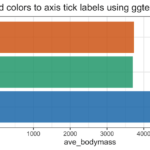
data <- gapminder %>%
  group_by(continent) %>%
  summarize(ave_lifeExp=mean(lifeExp))

data

## # A tibble: 5 × 2
##   continent ave_lifeExp
##   <fct>           <dbl>
## 1 Africa           48.9
## 2 Americas         64.7
## 3 Asia             60.1
## 4 Europe           71.9
## 5 Oceania          74.3
Barplot colored by variable
Let us go ahead and make a barplot using geom_col(). Here we also customize the plot by reordering the bars by ave lifeExp, added colors to bars, added a title and a caption.
data %>%
  ggplot(aes(y=fct_reorder(continent,ave_lifeExp), x=ave_lifeExp, fill=continent))+
  geom_col(alpha=0.8)+
  labs(y=NULL, title="Average life expectancy per continent",
       caption="data: gapminder")+
  theme(legend.position="none")
ggsave("how_to_add_colors_to_axis_tick_labels.png")
Our barplot looks great. However note that the y-axis tick labels naming the continents are grey color by default.

How to add color to axis tick labels with ggtext
element_markdown(), a new theme element available in the ggtext can render the axis text label as as markdown or html. Basically, element_markdown() is a replacement for element_text().
Let us prepare our data to add color to axis tick label. For that, we modify our dataframe to contain a column with colors we would like to use for each continent. And then create a new column with html code to colorize our continent variable.
data %>%
  mutate(
    color = c("#FF0000", "#000000",  "#D55E00", "#009E73","#FF00FF"),
    name = paste0("<i style='color:",color,"'>", continent,"</i>"),
    name = fct_reorder(name, ave_lifeExp)) %>%
  head()
The modified dataframe looks like this.
## # A tibble: 5 × 4
##   continent ave_lifeExp color   name
##   <fct>           <dbl> <chr>   <fct>
## 1 Africa           48.9 #FF0000 <i style='color:#FF0000'>Africa</i>
## 2 Americas         64.7 #000000 <i style='color:#000000'>Americas</i>
## 3 Asia             60.1 #D55E00 <i style='color:#D55E00'>Asia</i>
## 4 Europe           71.9 #009E73 <i style='color:#009E73'>Europe</i>
## 5 Oceania          74.3 #FF00FF <i style='color:#FF00FF'>Oceania</i>
Now we can go ahead and make the bar plot with the new variable containing html code for continent variable. Note we have added theme() layer with element_markdown() for y axis text.
data %>%
  mutate(
    color = c("#FF0000", "#000000",  "#D55E00", "#009E73","#FF00FF"),
    name = paste0("<i style='color:",color,"'>", continent,"</i>"),
    name = fct_reorder(name, ave_lifeExp)) %>%
  ggplot(aes(ave_lifeExp, name, fill = color)) +
  geom_col(alpha=0.7) +
  scale_fill_identity() +
  labs(y=NULL, title="Average life expectancy per continent",
       caption="source: gapminder")+
  theme(
    #customize tick label with element_markdown()
    axis.text.y = element_markdown(face="bold")
  )
ggsave("add_color_to_axis_tick_labels_ggtext.png")
Voila, now our barpot’s y-axis tick labels has some colors and it is the same as the colors we filled the bars with.

Explore the Complete ggplot2 Guide
35+ tutorials with code: scatterplots, boxplots, themes, annotations, facets, and more—tested and beginner-friendly.
Visit the ggplot2 Hub → No fluff—just code and visuals.