Last updated on August 14, 2025
In this tutorial, we will learn how to add arrows to both x and y axis in a plot made with ggplot2 in R. When we make a plot with ggplot2, it does not add arrows at the end of either x or y axis by default. Sometimes you might want to add arrows to either x-axis or y-axis to the plot made with ggplot2. ggplot2 enables adding arrows to x/y axis using axis.line argument to theme() function.
We will see multiple examples of adding arrows at the end of x/y axis to a plot made with ggplot2.
Let us load tidyverse.
library(tidyverse)
theme_set(theme_bw(16))
How to add arrows to axis in ggplot2
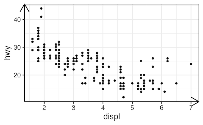
To add arrows at the of x and y axis, we will use arrow() function in the grid R package. The grid package in R has numerous basic graphical functions behind ggplot2. And it is imported by ggplot2 package. We will use arrow() function to element_line() function updating the theme of the plot as shown below.
ggplot(mpg, aes(displ, hwy)) +
  geom_point() +
  theme(
    axis.line = element_line(arrow = arrow())
  )
ggsave("add_arrows_to_x_y_axis_ggplot2.png")
By default arrow() function adds open arrowheads at the end of both x and y axis.
Add arrows with closed triangle to axis in ggplot2
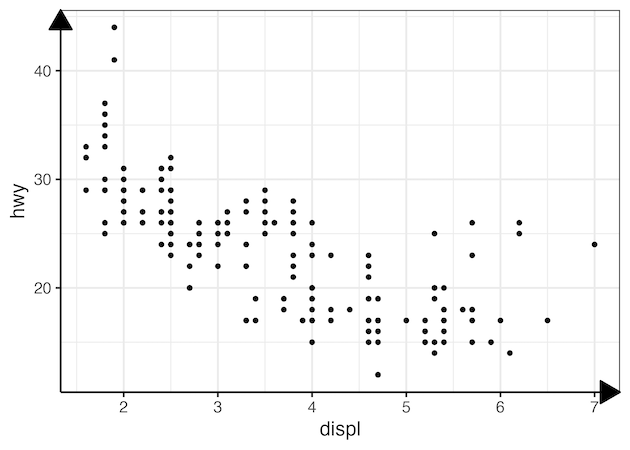
We can change the arrowhead to closed triangle by using type=”closed” argument to arrow() function.
mpg %>%
  ggplot(aes(displ, hwy)) +
  geom_point() +
  theme(
    axis.line = element_line(arrow = arrow(type="closed"))
  )
ggsave("add_closed_arrows_to_x_y_axis_ggplot2.png")
Customize arrows to axis in ggplot2
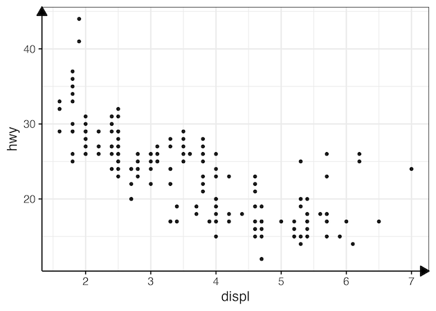
We can customize the length of the arrow using length argument as shown below.
mpg %>%
  ggplot(aes(displ, hwy)) +
  geom_point() +
  theme(
    axis.line = element_line(arrow = arrow(length = unit(0.4, "cm"),
                                           type="closed"))
  )
ggsave("customize_arrows_to_x_y_axis_ggplot2.png")
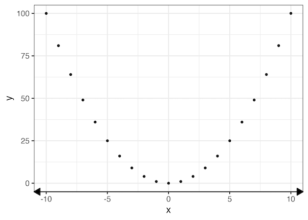
Add double arrows to axis in ggplot2
tibble(x = seq(-10,10),
       y = x^2) %>%
  ggplot(aes(x, y)) +
  geom_point() +
  theme(axis.line.x =
          element_line(arrow = arrow(length = unit(0.4, "cm"),
                                             type="closed",
                                             ends="both")))
ggsave("double_arrows_to_x_y_axis_ggplot2.png")
Add double arrows to x-axis and single arrow to y-axis in ggplot2
We can have specific type of arrow to either axis by using axis.line.x and axis.line.y argument to theme() function. In the example below, we add double arrows, i.e. arrows at both ends of axis, to x axis. And a single arrow to y-axis.
tibble(x = seq(-10,10),
       y = x^2) %>%
  ggplot(aes(x, y)) +
  geom_point() +
  theme(axis.line.x =
          element_line(arrow = arrow(length = unit(0.4, "cm"),
                                             type="closed",
                                             ends="both")),
        axis.line.y =
          element_line(arrow = arrow(length = unit(0.4, "cm"),
                                             type="closed")))
ggsave("double_arrows_on_x_and_single_arrow_on_y_axis_ggplot2.png")
Explore the Complete ggplot2 Guide
35+ tutorials with code: scatterplots, boxplots, themes, annotations, facets, and more—tested and beginner-friendly.
Visit the ggplot2 Hub → No fluff—just code and visuals.


