Last updated on September 6, 2025
Choosing colors for data visualization in R is hard—especially if you want charts that are clear, consistent, and inclusive. The RColorBrewer package (based on a href=”http://colorbrewer2.org/”>ColorBrewer2) gives you carefully designed sequential, diverging, and qualitative palettes that map well to how people perceive data.
In this guide, you’ll learn when to use each palette type and how to apply them in ggplot2, including color-blind friendly options and practical tips you can rely on.
1. What is RColorBrewer?
RColorBrewer is an R package that brings the ColorBrewer palettes into R. These palettes were designed by cartographer Cynthia Brewer to be perceptually balanced, print-friendly, and accessible. Instead of choosing random hex codes, you can rely on curated sets tested for clarity and usability. This makes them ideal for academic graphics, business dashboards, and data storytelling. If you are also interested in annotation techniques, check out how to annotate clusters with circle or ellipse in ggplot2.
install.packages("RColorBrewer")
library(RColorBrewer)
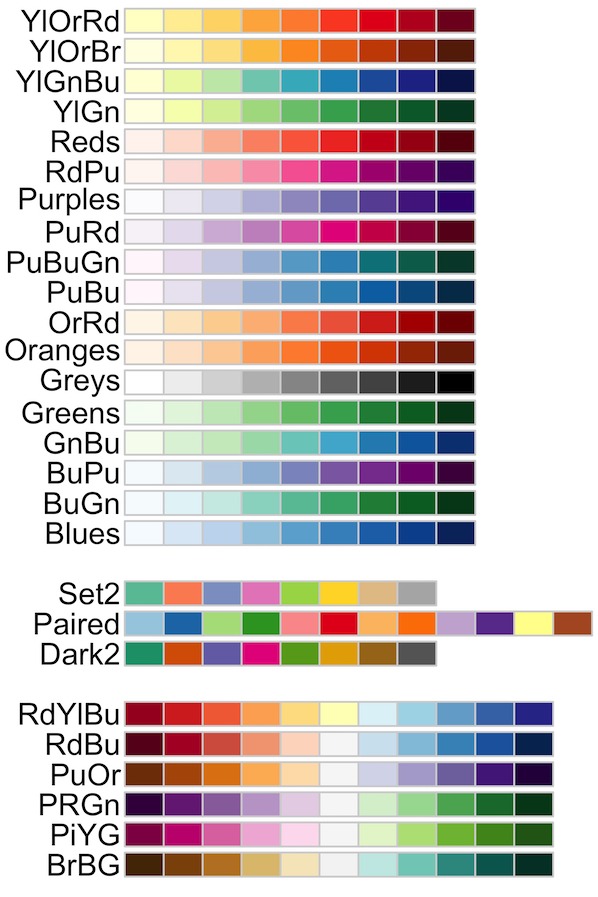
display.brewer.all()
Compared to picking arbitrary hex codes, Brewer palettes give you tested color sets that remain legible in print, projection, and for many viewers with color-vision deficiencies.
display.brewer.all()

2. Types of Color Palettes in RColorBrewer
RColorBrewer organizes its palettes into three families: sequential, diverging, and qualitative. Choosing the right palette ensures your data is interpreted correctly—sequential palettes emphasize magnitude, diverging palettes highlight deviations, and qualitative palettes distinguish categories. Below are examples of each type in action with ggplot2.
Sequential palettes
Sequential palettes are best for ordered data where values progress from low to high, such as population counts, temperatures, or sales volumes. These palettes use light-to-dark color schemes that naturally encode magnitude. For example, a bar chart of population growth becomes more intuitive when a sequential palette like Blues is applied. You can combine this with techniques like custom axis formatting to improve readability.
df  head()

df |>
  ggplot(aes(city, pop, fill=city)) +
  geom_col() +
  scale_fill_brewer(palette="Blues", guide="none")+
  labs(title="RColorBrewer: Sequential Palette Example")
ggsave("RColorBrewer_Sequential_Palette_Example.png")

Diverging palettes
Diverging palettes are designed for data that deviates around a meaningful center, such as profit vs. loss, test scores above and below average, or standardized z-scores. They use two contrasting hues with a neutral midpoint, making positive and negative differences stand out clearly. A heatmap of z-scores is a common example where the RdBu palette highlights above-average (red) and below-average (blue) values. If you want to extend this with shapes or highlights, check out how to highlight points in ggplot2.
library(palmerpenguins)
df_z
  drop_na() |>
  group_by(species) |>
  summarize(across(where(is.numeric), mean)) |>
  pivot_longer(-species,
               names_to="metric",
               values_to="value") |>
  group_by(metric) |>
  mutate(z=(value-mean(value))/sd(value)) |>
  ungroup()

df_z |> head()


species metric value z
Adelie	bill_length_mm	38.82397	-1.1468905
Adelie	bill_depth_mm	18.34726	0.5585044
Adelie	flipper_length_mm	190.10274	-0.7656791
Adelie	body_mass_g	3706.16438	-0.5942492
Adelie	year	2008.05479	0.4550641
Chinstrap	bill_length_mm	48.83382	0.6895555
df_z |>
  ggplot(aes(species,
             metric,
             fill=z)) +
  geom_tile(color="white") +
  scale_fill_distiller(palette="RdBu",
                       direction=-1)
ggsave("RColorbrewer_diverging_palette_heatmap_example.png")

Qualitative palettes
Qualitative palettes are ideal for categorical data where the goal is to separate groups rather than encode magnitude. Each category is assigned a distinct color, making it easy to compare groups such as species, regions, or product types. A scatterplot of penguin species is a good example, where the Set2 palette ensures each species is visually distinct. For another approach to category visualization, explore adding text labels to ggplot2.
penguins |>
  ggplot( aes(bill_length_mm,
             flipper_length_mm,
             color=species)) +
  geom_point(size=2,
             alpha=0.8,
             na.rm=TRUE) +
  scale_color_brewer(palette="Set2")
ggsave("RColorbrewer_qualitative_palette_example.png")

3. Using RColorBrewer with ggplot2
The RColorBrewer palettes work seamlessly with ggplot2. Depending on whether your variable is categorical or continuous, you will use different functions to apply palettes. This section shows the key functions, when to use them, and examples for each.
| Data Type | Function | Palette Type | Example Use |
|---|---|---|---|
| Categorical (discrete groups) |
scale_fill_brewer() / scale_color_brewer()
|
Qualitative | Boxplots, bar charts, stacked charts |
| Continuous (numeric values) |
scale_fill_distiller() / scale_color_distiller()
|
Sequential or Diverging | Heatmaps, scatterplots with gradients |
Using scale_fill_brewer() for categorical groups
scale_fill_brewer() applies a qualitative palette to discrete categories. This is ideal for grouped bar charts, boxplots, or stacked charts where each category needs its own distinct color. In the example below, penguin species are assigned colors from the Set2 palette, making it easy to distinguish groups without implying any numerical order. Brewer’s qualitative palettes are designed to maximize contrast and readability across categories.
library(palmerpenguins)

penguins |>
  ggplot(aes(species, body_mass_g, fill = species)) +
  geom_boxplot() +
  scale_fill_brewer(palette = "Set2") +
  theme(legend.position="none")+
  labs(title = "Categorical groups with scale_fill_brewer",
       x = "Species",
       y = "Body mass (g)")
ggsave("RColorBrewer_scale_fill_brewer_example.png")

Using scale_color_distiller() for continuous values
scale_color_distiller() is designed for continuous variables, creating a smooth gradient from a sequential or diverging palette. It is particularly useful when mapping measurements such as temperature, counts, or body size to color in scatterplots or heatmaps. In the example below, penguin body mass is mapped to color using the YlGnBu palette, where lighter shades represent lighter penguins and darker shades indicate heavier penguins. This allows viewers to see both trends and outliers at a glance.
penguins |>
  ggplot(aes(bill_length_mm,
             flipper_length_mm,
             color = body_mass_g)) +
  geom_point(size = 2,
             alpha = 0.8,
             na.rm = TRUE) +
  scale_color_distiller(palette = "YlGnBu",
                        direction = 1) +
  labs(title = "Continuous mapping with scale_color_distiller",
       subtitle = "Body mass mapped to color with YlGnBu palette",
       x = "Bill length (mm)",
       y = "Flipper length (mm)",
       color = "Body mass (g)")
ggsave("RColorBrewer_continuous_mapping_scale_color_distiller.png")

4. Color-Blind Friendly Palettes
About 8% of men and 0.5% of women live with some form of color vision deficiency, which means charts using poor color choices can be misleading or unreadable for many viewers. The RColorBrewer package helps solve this by marking which palettes are safe for color-blind audiences.
Using these palettes improves accessibility, ensures fair interpretation of your data, and makes your visualizations more inclusive. You can check for safe palettes directly in R and visualize them before applying to your plots.
# List only color-blind friendly palettes

brewer.pal.info |>
  filter(colorblind == TRUE) |>
  head()
##        maxcolors category colorblind
## BrBG          11      div       TRUE
## PiYG          11      div       TRUE
## PRGn          11      div       TRUE
## PuOr          11      div       TRUE
## RdBu          11      div       TRUE
## RdYlBu        11      div       TRUE
# Show all color-blind safe palettes visually
display.brewer.all(colorblindFriendly = TRUE)
# Show all color-blind safe palettes visually
display.brewer.all(colorblindFriendly = TRUE)
Sequential blue and purple gradients, diverging blue–orange schemes, and qualitative sets such as Set2 or Dark2 are generally recommended. These palettes remain distinct even when certain colors are harder to perceive. The example below shows a side-by-side comparison between a non-friendly palette and a color-blind friendly palette in ggplot2 boxplots, highlighting why thoughtful palette choice matters.
Example: Comparing non-friendly vs. friendly palettes
When visualizing categorical groups, using a non-friendly palette can cause confusion because some colors may appear indistinguishable to people with red–green color blindness. In contrast, a color-blind friendly palette ensures that each group remains distinct and interpretable. The following example compares two boxplots of penguin body mass by species: one styled with the Paired palette (not safe), and one styled with the Set2 palette (safe). Notice how the Set2 version is easier to interpret and more accessible.
library(tidyverse)
library(palmerpenguins)
# Non-friendly qualitative palette (Paired)
p_non
  ggplot(aes(species,
             body_mass_g,
             fill = species)) +
  geom_boxplot() +
  scale_fill_brewer(palette = "Paired") +
  labs(title = "Non-friendly palette (Paired)",
       x = "Species",
       y = "Body mass (g)") +
  theme(legend.position = "none")
# Save plot
ggsave("rcolorbrewer-nonfriendly.png", p_non, width=6, height=4, dpi=200)

# Friendly qualitative palette (Set2)
p_friendly
  ggplot(aes(species,
             body_mass_g,
             fill = species)) +
  geom_boxplot() +
  scale_fill_brewer(palette = "Set2") +
  labs(title = "Color-blind friendly palette (Set2)",
       x = "Species", y = "Body mass (g)") +
  theme(legend.position = "none")
ggsave("rcolorbrewer-friendly.png", p_friendly, width=6, height=4, dpi=200)

5. Practical Tips for Choosing Palettes
RColorBrewer offers many options, but choosing the right palette depends on your data type and the story you want to tell. Below are practical guidelines with references to examples shown earlier in this guide, so you can quickly apply the right palette in your own visualizations.
Use sequential palettes for ordered data
Sequential palettes are best when your values move in one direction, such as counts, percentages, or continuous measures like temperature. They use light-to-dark shades that make it easy to spot high and low values. See sequential palette example above.

Use diverging palettes for deviations around a midpoint
Diverging palettes are ideal for showing values above and below a central point such as zero, an average, or a target. They use two contrasting hues with a neutral center, making deviations stand out clearly. See diverging palette example above.

Use qualitative palettes for categories
Qualitative palettes are designed for unordered categories such as species, product types, or regions. Each group gets a distinct color, making it easy to compare categories without implying order. See qualitative palette example above.

Limit the number of categories
Most qualitative palettes support up to 8–12 colors. Adding more categories makes it harder to distinguish groups and reduces clarity. If you have many categories, consider grouping them, filtering for key values, or using faceting instead of forcing all into a single chart.
Avoid misleading color choices
Always align palette type with data type. For example, avoid using sequential palettes for categories, since they suggest order where none exists. Be cautious with red–green contrasts, as they are problematic for many color-blind viewers. Choose palettes flagged as color-blind friendly, such as Set2, Dark2, or safe sequential schemes, to keep your charts accessible.
Quick Reference: RColorBrewer Palette Choice in ggplot2
| Palette Type | When to Use | ggplot2 Function | Recommended Palettes | Example |
|---|---|---|---|---|
| Sequential | Ordered values progressing low → high (counts, percentages, temps) |
scale_fill_distiller() / scale_color_distiller()
|
Blues, Greens, Purples, YlGnBu | See sequential example |
| Diverging | Deviations around a center (0, mean, target) |
scale_fill_distiller() / scale_color_distiller()
|
RdBu, RdYlBu, PuOr | See diverging example |
| Qualitative | Unordered categories (species, regions, groups) |
scale_fill_brewer() / scale_color_brewer()
|
Set2, Dark2, Set3 | See qualitative example |
Accessibility tip: Whenever possible, prefer palettes flagged as color-blind friendly, such as Set2, Dark2, many blue/purple sequentials, and blue–orange diverging schemes. You can quickly check safe options with brewer.pal.info or preview them using display.brewer.all(colorblindFriendly = TRUE). See accessibility guidance above.