• Skip to primary navigation
  • Skip to main content
  • Skip to primary sidebar

Data Viz with Python and R

Learn to Make Plots in Python and R

  • Home
  • Seaborn
  • Matplotlib
  • ggplot2
  • Altair
  • About
    • Privacy Policy
  • Visualizing Activation Functions in Neural Networks
  • Confusion Matrix Calculator
  • Visualizing Dropout Rate in Neural Network
  • Visualizing Loss Functions in Neural Networks
  • Show Search
Hide Search

Area Chart with Altair in Python

datavizpyr · February 7, 2020 ·

Last updated on February 4, 2020

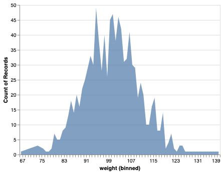
In this post, we will see how to make simple area chart with Altair in Python. Area chart displays a quantitative variable like a line plot or density plot but coloring the area under the curve. In Altair, we can make area chart with mark_area() function.

Let us first load Altair and the needed packages.

import altair as alt
import pandas as pd
import numpy as np

We will generate data to make area chart using NumPy’s random module and create a Pandas dataframe for it.

# Generating Data
np.random.seed(42)
df = pd.DataFrame({
    'weight': np.random.normal(100, 10, 1000)
})

Our data to make are chart is ready. Now we can provide the data to Altair’s chart object and use mark_area() function to specify that we are making area chart. And then specify our x axis and y-axis variables.

alt.Chart(df).mark_area(opacity=0.7).encode(
      alt.X('weight:Q', bin=alt.Bin(maxbins=100)),
      alt.Y('count(*):Q')
)

And we get a simple area chart as shown below.

Area Chart with Altair in Python

Related posts:

Scatter plot with regression line using AltairScatter Plot with Regression Line using Altair in Python Highlight a bar in barplot in AltairHow To Highlight a Bar in Bar Chart in Altair? Stripplot Altair with jitterHow To Make Stripplot with Jitter in Altair Python? How to remove legend boxplot Altair?8 Tips to Make Better Boxplots with Altair in Python

Filed Under: Altair, Area Chart with Altair, Python Tagged With: Altair, Python

Primary Sidebar

Python & R Viz Hubs

  • Seaborn Guide & Cookbook
  • ggplot2 Guide & Cookbook
  • Matplotlib Guide & Cookbook
  • Confusion Matrix Calculator
  • Visualizing Activation Functions
  • Visualizing Dropout
  • Visualizing Loss Functions

Buy Me a Coffee

Copyright © 2026 · Daily Dish Pro on Genesis Framework · WordPress · Log in

Go to mobile version