Last updated on August 14, 2025
Need to emphasize specific groups or outliers in your boxplot visualizations? This comprehensive guide shows you exactly how to highlight and select boxplots in R using ggplot2, with step-by-step practical examples and customizable code snippets that work immediately.
Boxplots are powerful tools for visualizing data distributions and identifying outliers, but sometimes you need to draw attention to one or more specific groups, highlight significant differences. Whether you’re comparing treatment groups in medical research, analyzing sales performance across regions, or presenting survey results with key demographics highlighted, learning to selectively emphasize boxplots can dramatically improve your data storytelling.
In this tutorial, we will learn how to highlight a select boxplot using ggplot2 in R. By highlighting a select boxplot with specific color, we can easily divert the attention to it.
Let us first load the packages needed. We will use Palmer Penguins dataset to make boxplots.
library(tidyverse)
library(palmerpenguins)
theme_set(theme_bw(16))
Our data looks like this.
penguins |>
  head()

# A tibble: 6 × 8
  species island    bill_length_mm bill_depth_mm flipper_length_mm body_mass_g
  <fct>   <fct>              <dbl>         <dbl>             <int>       <int>
1 Adelie  Torgersen           39.1          18.7               181        3750
2 Adelie  Torgersen           39.5          17.4               186        3800
3 Adelie  Torgersen           40.3          18                 195        3250
4 Adelie  Torgersen           NA            NA                  NA          NA
5 Adelie  Torgersen           36.7          19.3               193        3450
6 Adelie  Torgersen           39.3          20.6               190        3650
# ℹ 2 more variables: sex <fct>, year <int>
Here is a simple boxplot with species on x-axis and body mass of penguins on y-axis.
penguins |>
  ggplot(aes(species, body_mass_g))+
  geom_boxplot()+
  labs(title="How to highlight select boxplot")
ggsave("how_to_highlight_select_boxplot.png")
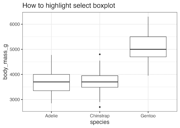
How to highlight select boxplot in ggplot2
In order to highlight one of the boxplots, we first need to create a new variable that defines which boxplot needs to be highlighted. In the example below we aim to highlight Gentoo species as it has large body mass among the three penguin species.
By naively adding the highlight variable either as fill or color, we can add color to the boxplot.
penguins |>
  mutate(highlight = ifelse(species == "Gentoo", "Highlighted", "Normal")) %>%
  ggplot(aes(species, body_mass_g, fill=highlight))+
  geom_boxplot()+
  labs(title="How to highlight select boxplot")
ggsave("highlight_select_boxplot_1.png")
Unfortunately it also adds colors to other boxplots as well not just the one we wanted to highlight.

We can get around this problem by manually specifying the color we want to highlight the box plot. IN the example below, we manually set color using scale_fill_manual() function such that the box plot we want to highlight is blue and the rest are white.
penguins |>
  mutate(highlight = ifelse(species == "Gentoo", "Highlighted", "Normal")) %>%
  ggplot(aes(species, body_mass_g, fill=highlight))+
  geom_boxplot()+
  scale_fill_manual(values = c("steelblue", "white")) +
  theme(legend.position = "none")+
  labs(title="How to highlight select boxplot")
ggsave("highlight_select_boxplot_with_specific_color.png")

Explore the Complete ggplot2 Guide
35+ tutorials with code: scatterplots, boxplots, themes, annotations, facets, and more—tested and beginner-friendly.
Visit the ggplot2 Hub → No fluff—just code and visuals.