Last updated on December 19, 2020
In this tutorial, we will see how to make density plots with ggplot2 in R. We will start with an example of making a basic density plot with ggplot2 and see multiple examples of making the density plots better.
Let us load tidyverse, a suite R packages from RStudio and also set the default theme to theme_bw() for all the plots we make.
library(tidyverse)
theme_set(theme_bw(base_size=16))
To make density plots we will use 2019 Stack Overflow survey data. The results from the survey is processed and is available at datavizpyr.com‘s github page.
stackoverflow_file <- "https://raw.githubusercontent.com/datavizpyr/data/master/SO_data_2019/StackOverflow_survey_filtered_subsampled_2019.csv"

survey_results <- read_csv(stackoverflow_file)
The survey data is a fantastic data source for understanding data science/developers work life with many interesting variables. In this tutorial, we will mainly use distribution of developers salary in US to make density plots with ggplot2.
## # A tibble: 5 x 4
##   CompTotal Gender Manager YearsCode
##       <dbl> <chr>  <chr>   <chr>
## 1    180000 Man    IC      25
## 2     55000 Man    IC      5
## 3     77000 Man    IC      6
## 4     67017 Man    IC      4
## 5     90000 Man    IC      6
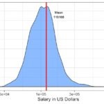
Let us make the most basic density plot with ggplot2 in R. With ggplot2, we can make density plot using geom_density() function. We specify x-axis aesthetics, the variable we want to make density plot to ggplot’s aes() function and add geom_density() as another layer to make density plot. In this example code we have below, we also specify x axis label and show how to save the plot as jpg file using ggsave() function.
survey_results %>%
  ggplot(aes(x=CompTotal)) +
  geom_density() +
  labs(x="Developer Salary")
ggsave("simple_density_plot_ggplot2_R.jpg")
The basic density plot looks like this with mean salary around 100K, but with a few outlier developers with very high salaries.
Density plot with ggplot2 with fill color
Let us improve the density plot with adding a color manually to fill the density curve. We can fill the density plot with a color using fill argument. We can use fill with in aes() function or within geom_density() function. In this example, we are manually filling the plot with a specific color with fill=”dodgerblue” inside geom_density() function.
survey_results %>%
  ggplot(aes(x=CompTotal)) +
  geom_density(fill="dodgerblue")  +
  labs(x="Developer Salary")
ggsave("simple_density_plot_with_color_ggplot2_R.jpg")
The density plot with fill color look like this.
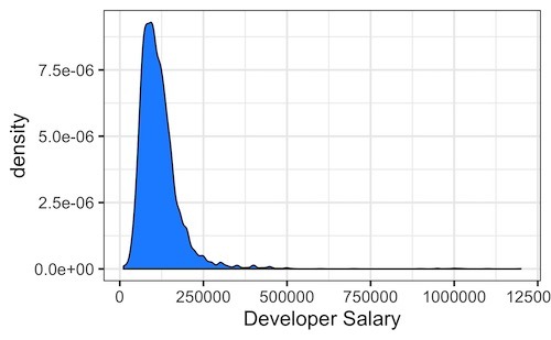
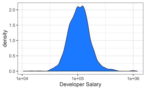
Our density plot is skewed because outlier developer salary. A better way to handle the skewness due to outliers is to change the scale the of the data. Here we can make the density plot with log scale on x-axis.
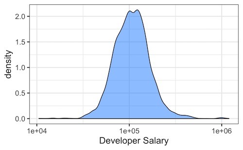
Density plot with ggplot2 in log scale
In ggplot2, we can change the x-axis scale to log scale by adding scale_x_log10() function. scale_x_log10() function will show the developer salary on a logarithmic scale, instead of the original scale.
survey_results %>%
  ggplot(aes(x=CompTotal)) +
  geom_density(fill="dodgerblue")  +
  scale_x_log10()+
  labs(x="Developer Salary")
Our density plot in R using logarithmic scale on x-axis looks much better now.
Density plot with ggplot2 with transparent color fill
We can also change the transparency level of the fill color by setting alpha values ranging from 0 to 1 inside geom_density() function.
survey_results %>%
  ggplot(aes(x=CompTotal)) +
  geom_density(fill="dodgerblue", alpha=0.5)  +
  scale_x_log10()+
  labs(x="Developer Salary")
In this example, we have set the transparency level to 50% with alpha=0.5.