Last updated on August 13, 2025
Reversing legend order in ggplot2 is essential for creating intuitive data visualizations where the legend arrangement matches your data hierarchy or presentation needs. By default, ggplot2 displays legend keys in alphabetical order, but often you’ll want to reverse ggplot2 legend order to better align with your data story or visual flow.
In this comprehensive ggplot2 legend reversal tutorial, you’ll learn how to change legend key order using the guides() function with guide_legend(reverse = TRUE). We’ll cover both color-based and fill-based legends with practical examples you can immediately apply to your R data visualization projects.
When to Reverse Legend Order in ggplot2
Common scenarios for reversing ggplot2 legends:
- Displaying ordinal data in logical sequence (e.g., Low → Medium → High)
- Matching legend order to stacked bar chart ordering
- Creating intuitive color progressions for categorical variables
- Aligning legend sequence with data importance or hierarchy
In ggplot2, when we color by a variable using color or fill argument in side aes(), we get a legend with keys showing which keys match which colors. Here we will show how to reverse the order of legend keys using guides() argument for two types of plots, one scatter plot with legend made by “color” argument, and a bar plot with colors added “fill” argument.
Let us get started by loading tidyverse.
library(tidyverse)
theme_set(theme_bw(16))
We will be using diamonds data available from tidyverse.
diamonds %>% head()

## # A tibble: 6 × 10
##   carat cut       color clarity depth table price     x     y     z
##   <dbl> <ord>     <ord> <ord>   <dbl> <dbl> <int> <dbl> <dbl> <dbl>
## 1  0.23 Ideal     E     SI2      61.5    55   326  3.95  3.98  2.43
## 2  0.21 Premium   E     SI1      59.8    61   326  3.89  3.84  2.31
## 3  0.23 Good      E     VS1      56.9    65   327  4.05  4.07  2.31
## 4  0.29 Premium   I     VS2      62.4    58   334  4.2   4.23  2.63
## 5  0.31 Good      J     SI2      63.3    58   335  4.34  4.35  2.75
## 6  0.24 Very Good J     VVS2     62.8    57   336  3.94  3.96  2.48
Reverse Legend Key orders with guides(): Example 1 – scatter plot with colored dots
Let us make a scatter plot between two variables and color by a third (categorical) variable using color argument within aes().
Here we use randomly sampled 200 data points from diamonds data to make the scatter plot using slice_sample() function.
diamonds %>%
  slice_sample(200) %>%
  ggplot(aes(x=carat, y=price, color=cut))+
  geom_point()
ggsave("how_to_reverse_legend_key_order_legend_with_color.png")
And this is how the scatter plot looks like with default legend key ordering.

We can reverse the legend key order using guides() function with color argument. We use color argument to reverse as we created the legend earlier using color argument in aes() function. guide_legend() function with reverse = TRUE actually reverses the kegend key order.
diamonds %>%
  slice_sample(n=200) %>%
  ggplot(aes(x=carat, y=price, color=cut))+
  geom_point()+
  guides(color = guide_legend(reverse = TRUE))
ggsave("reverse_legend_key_order_legend_with_color.png")

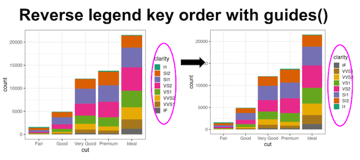
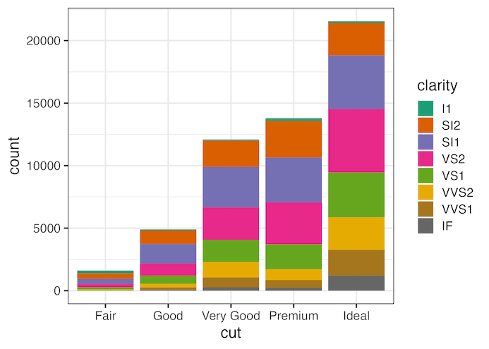
Reverse Legend Key orders with guides(): Example 2 with bar plot with fill color
In the second example, let us make a barplot filled with colors specified by a second variable. Heere wee use fill argument within aes() to add colors, fill the bars with colors.
diamonds %>%
  ggplot(aes(cut, fill=clarity))+
  geom_bar()+
  scale_fill_brewer(palette="Dark2")
ggsave("how_to_reverse_legend_key_order_legend_with_fill.png")
The barplot below shows the default legend key ordering.
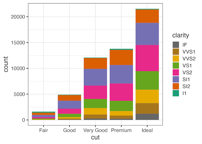
We can use guides() function, but this time using fill argument to reverse the legend key order here as the legend was created using fill argument within aes().
diamonds %>%
  ggplot(aes(cut, fill=clarity))+
  geom_bar()+
  scale_fill_brewer(palette="Dark2")+
  guides(fill = guide_legend(reverse = TRUE))
ggsave("reverse_legend_key_order_for_legend_with_fill.png")
Explore the Complete ggplot2 Guide
35+ tutorials with code: scatterplots, boxplots, themes, annotations, facets, and more—tested and beginner-friendly.
Visit the ggplot2 Hub → No fluff—just code and visuals.