Last updated on August 29, 2025
Encircle Data Points in R with geom_encircle()
When working with scatter plots in R, it is often helpful to highlight or emphasize groups of data points. The ggalt package provides an elegant solution through the geom_encircle() function. This function automatically draws smooth, freehand-style contours around points, making it easy to highlight categories, clusters, or specific subsets of data.
Compared to alternatives such as stat_ellipse() or geom_mark_ellipse() from ggforce, geom_encircle() offers a more natural and flexible way to annotate visualizations. In this tutorial, we will explore how to use geom_encircle() with practical ggplot2 examples.
Setting Data and Packages
Let us load the packages needed. We can install ggalt from CRAN (current version 0.4.0). We will also use the palmerpenguins dataset for scatter plots and highlighting groups of points.
library(tidyverse)
library(palmerpenguins)
library(ggalt)

theme_set(theme_bw(16))
packageVersion("ggalt")
# 0.4.0
Basic Scatter Plot
penguins |>
  ggplot(aes(x = flipper_length_mm,
             y = body_mass_g,
             color = species)) +
  geom_point()
Circling Data Points with geom_encircle()
We can use geom_encircle() as an additional layer to automatically detect and encircle groups of points.
penguins |>
  ggplot(aes(x = flipper_length_mm,
             y = body_mass_g,
             color = species)) +
  geom_point() +
  geom_encircle(s_shape = 1, expand = 0)
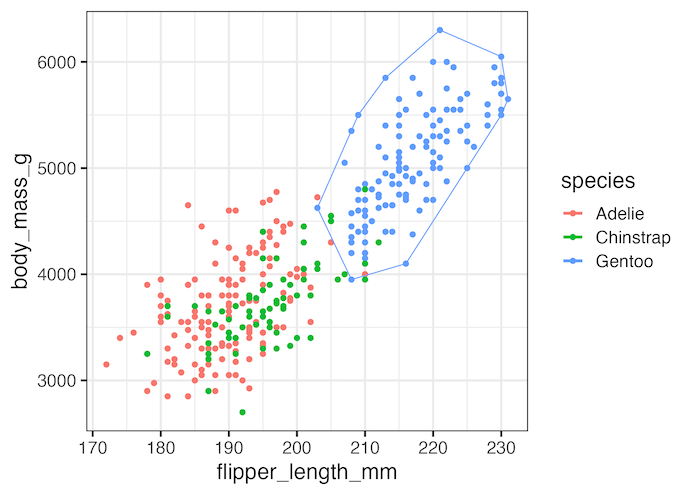
In this example, geom_encircle() encircles three groups (species). If we had not added color = species, ggalt’s function would encircle all points together.

Encircling Select Data Points
We can also choose to highlight only a subset of data points. In this example, we encircle only Gentoo penguins by filtering the dataset within geom_encircle().
penguins %>%
  ggplot(aes(x = flipper_length_mm,
             y = body_mass_g,
             color = species)) +
  geom_point() +
  geom_encircle(data = dplyr::filter(penguins, species == "Gentoo"),
                s_shape = 1, expand = 0)

ggsave("encircle_select_points_ggalt_geom_encircle.png")
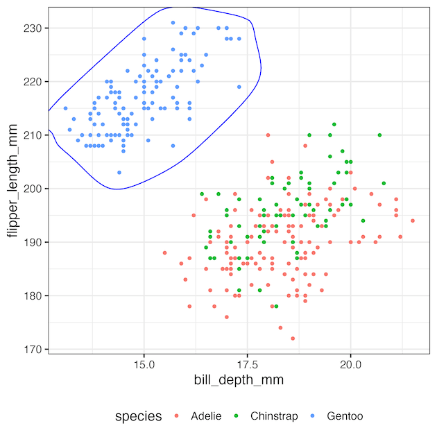
Another Example: Customizing Encircles
We can also encircle groups on a different scatter plot and customize appearance.
penguins |>
  ggplot(aes(x = bill_depth_mm, y = flipper_length_mm, color = species)) +
  geom_point() +
  geom_encircle(data = penguins |> dplyr::filter(species == "Gentoo"),
                aes(x = bill_depth_mm, y = flipper_length_mm),
                color = "blue", size = 1.5, expand = 0.02, s_shape = 0.5)
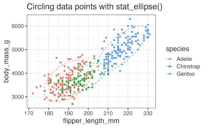
geom_encircle() vs Alternatives
-
geom_encircle()(ggalt) — freehand-style contour that wraps points; great for emphasis and storytelling. -
stat_ellipse()(ggplot2) — statistical ellipse (e.g., 90% CI) informed by variance/covariance; good for inference. -
geom_mark_ellipse()(ggforce) — contour + label tools for annotated clusters.
Each method is useful depending on whether you need a statistical shape or a freehand contour for emphasis. For a deeper dive into ellipse-based methods, check out our tutorial on highlighting specific groups in ggplot2. This complements geom_encircle() by showing how to emphasize subsets with ellipses or polygons.
Comparison with stat_ellipse()
penguins |>
  ggplot(aes(flipper_length_mm, body_mass_g, color = species)) +
  geom_point() +
  stat_ellipse(level = 0.90, linetype = "dashed")
What is ggalt?
ggalt (short for “ggplot2 Altered”) is an extension package for ggplot2 developed by Bob Rudis.
It provides additional geoms, scales, and statistical transformations that are not included in base ggplot2. Some other useful features include:
-
geom_encircle()– encircle points or groups of data (used in this tutorial). -
geom_dumbbell()– create dumbbell charts for comparing two values per category. -
geom_lollipop()– an alternative to bar charts. -
geom_xspline()– draw smooth curves through points.
While not as large as packages like ggforce, ggalt adds handy tools for annotation, highlighting, and alternative chart types. You can find more details in the ggalt vignette on CRAN.
Conclusion
The geom_encircle() function is a powerful yet simple way to highlight data in ggplot2. Whether you want to automatically encircle groups, emphasize a specific category, or customize the style of your contour, ggalt makes it straightforward. By experimenting with arguments like expand, s_shape, color, and size, you can fine-tune the effect to match your visualization needs. Together with related techniques such as stat_ellipse() and geom_mark_ellipse(), this gives you multiple options for annotating clusters and groups in R. Explore these methods to make your visualizations more clear and compelling.
Related Tutorials
- Annotate clusters with circle or ellipse in R
- Highlight specific groups in ggplot2
- Label points with ggrepel in ggplot2
FAQs
Q1. What is geom_encircle in R?
geom_encircle() is a function from the ggalt package that draws smooth contours around data points in a scatter plot, making it easy to highlight groups or categories.
Q2. How do I change the color or style of the encircle outline?
You can customize encircles by adding arguments such as color, linetype, size, and alpha inside geom_encircle(). For example:
geom_encircle(color = "blue", linetype = "dashed", size = 1.2)
Q3. Can I encircle overlapping groups in ggplot2?
Yes. When groups overlap, geom_encircle() will draw separate contours, but you can control spacing with the expand parameter or change the curve with s_shape to reduce overlaps.
Q4. Why use geom_encircle instead of stat_ellipse?
geom_encircle() draws freehand-style contours that simply wrap around your points, while stat_ellipse() computes a statistical ellipse based on variance and correlation. Use geom_encircle() for emphasis and stat_ellipse() for statistical interpretation.
Explore the Complete ggplot2 Guide
35+ tutorials with code: scatterplots, boxplots, themes, annotations, facets, and more—tested and beginner-friendly.
Visit the ggplot2 Hub → No fluff—just code and visuals.

