Last updated on August 22, 2025
In this post, we will learn how to visualize a dataframe with missing values represented as NAs as a heatmap. A quick visualization of missing values in the data is useful in analyzing the data. We will use mainly tidyverse approach, first to create a toy dataframe with missing values, then use ggplot2’s geom_tile() function to make the heatmap and add specific color to represent NAs using scale_fill_continuous() function.
👉 Want more? Explore the full Seaborn Tutorial Hub with 35+ examples, code recipes, and best practices.
Let us get started by loading tidyverse and palmer penguins dataset.
library(tidyverse)
library(palmerpenguins)
theme_set(theme_bw(16))
We will consider only the numeric columns and select just the few rows for illustration.
penguins <- penguins  %>%
  select(where(is.numeric)) %>%
  select(-year) %>%
  drop_na() %>%
  head()
Our toy data looks like this, six rows with no missing values.
penguins

# A tibble: 6 × 4
  bill_length_mm bill_depth_mm flipper_length_mm body_mass_g
           <dbl>         <dbl>             <int>       <int>
1           39.1          18.7               181        3750
2           39.5          17.4               186        3800
3           40.3          18                 195        3250
4           36.7          19.3               193        3450
5           39.3          20.6               190        3650
6           38.9          17.8               181        3625
Adding NAs randomly to a dataframe using tidyverse
Let us add NAs to the toy dataframe randomly. We use across() function in combination with mutate() to introduce NAs in each column. We introduce NAs probabilistically with 20% chance for missing value at each element.
set.seed(42)
df <- penguins%>%
  mutate(across(where(is.numeric),
                ~ifelse(sample(c(TRUE, FALSE),
                               size = n(),
                               replace = TRUE,
                               prob = c(0.8, 0.2)),
                        ., NA)))
Our data with missing values look like this.
df

# A tibble: 6 × 4
  bill_length_mm bill_depth_mm flipper_length_mm body_mass_g
           <dbl>         <dbl>             <int>       <int>
1           NA            18.7                NA        3750
2           NA            17.4               186        3800
3           40.3          18                 195          NA
4           NA            19.3                NA        3450
5           39.3          20.6                NA          NA
6           38.9          17.8               181          NA
Visualizing Dataframe with NAs as heatmap
To make a heatmap, we will use ggplot2’s geom_tile() function. First wee need to reshape the data into tidy long form using pivot_longer() function. We also add unique row number to help us make the heatmap.
df_tidy <- df %>%
  scale() %>%
  as.data.frame() %>%
  mutate(row_id=row_number()) %>%
  pivot_longer(-row_id, names_to="feature", values_to="values")
Our tidy data with NAs look like this
df_tidy

# A tibble: 24 × 3
   row_id feature            values
    <int> <chr>               <dbl>
 1      1 bill_length_mm    NA
 2      1 bill_depth_mm      0.0566
 3      1 flipper_length_mm NA
 4      1 body_mass_g        0.440
 5      2 bill_length_mm    NA
 6      2 bill_depth_mm     -1.05
 7      2 flipper_length_mm -0.188
 8      2 body_mass_g        0.704
 9      3 bill_length_mm     1.11
10      3 bill_depth_mm     -0.538
# … with 14 more rows
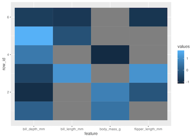
Now we can go ahead and make a heatmap using geom_tile() function. Here x-axis will be the penguin features and y axis is each penguin. We fill each tile by the values of the features. Note that we have scaled the values of each column as they were on very different scales.
df_tidy %>%
  ggplot(aes(x=feature, y=row_id, fill=values))+
  geom_tile()
geom_tile() recognizes NA values in our data and colors them as grey.
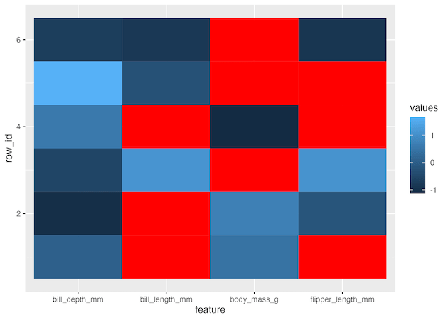
If needed we can customise the tiles for NAs with a color of choice using scale_fill_continuous().
df_tidy %>%
  ggplot(aes(x=feature, y=row_id, fill=values))+
  geom_tile()+
  scale_fill_continuous(na.value = 'red')
Also note that when we reshape our data from wide to long, the column order on the heatmap is different from the original column order. The heatmap’s column order is sorted alphabetically and it is the same order as shown below.
df %>%
  select(sort(names(.)))

# A tibble: 6 × 4
  bill_depth_mm bill_length_mm body_mass_g flipper_length_mm
          <dbl>          <dbl>       <int>             <int>
1          18.7           NA          3750                NA
2          17.4           NA          3800               186
3          18             40.3          NA               195
4          19.3           NA          3450                NA
5          20.6           39.3          NA                NA
6          17.8           38.9          NA               181
Explore the Complete ggplot2 Guide
35+ tutorials with code: scatterplots, boxplots, themes, annotations, facets, and more—tested and beginner-friendly.
Visit the ggplot2 Hub → No fluff—just code and visuals.

