Last updated on September 5, 2025
In this post, we will learn how to make grouped violin plot with jittered data points on top of it using ggplot2 in R. One of the challenges in making grouped violin or box plots with jittered data points is proper alignment of data points and the underlying plot. In an earlier tutorial, we addressed the alignment problem while making grouped boxplots with jittered data points. Although the same approach does not solve the problem fully for violinplot. In this tutorial, we will show how geom_sina() function ggforce will have add jittered data points to grouped violin plots.

library(tidyverse)
library(palmerpenguins)
theme_set(theme_bw(16))
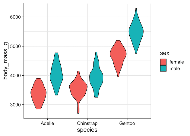
Grouped Violin plot in ggplot2
In ggplot2, we can make violin plots using geom_violin(). TO make a grouped violin plot, we use either fill or color argument to aes() function with the column/variable that we want to group by.
penguins |>
  drop_na() |>
  ggplot(aes(x=species,
             y=body_mass_g,
             fill=sex))+
  geom_violin()
ggsave("grouped_violin_plot_ggplot2_R.png")
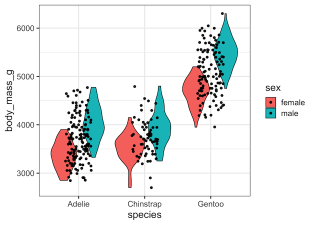
Grouped Violin plot in ggplot2 with jittered data points using geom_jitter()
To add jittered data points to the gouped violin plot, if we use geom_jitter(), it will not work, just like it does not for boxplot.
penguins |>
  drop_na() |>
  ggplot(aes(x=species,
             y=body_mass_g,
             fill=sex))+
  geom_violin()+
  geom_jitter(width=0.5)
ggsave("grouped_violin_plot_with_data_geom_jitter_ggplot2_R.png")
jittered points will not align nicely with the grouped violin plots.
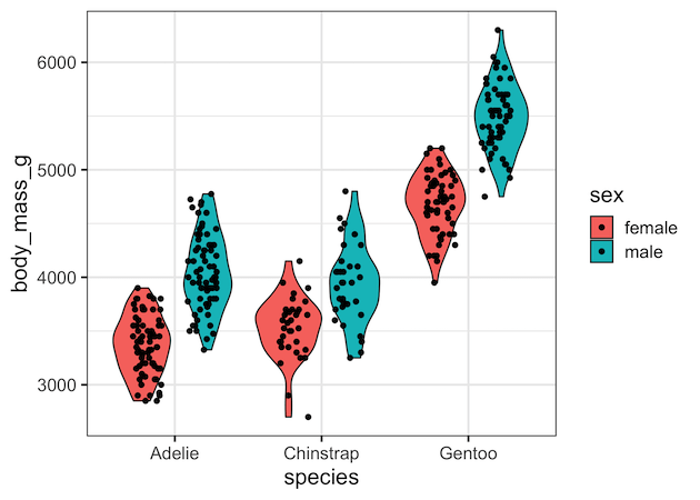
Grouped Violin plot in ggplot2 with jittered data points using geom_points() with position_jitterdodge()
One of the solutions to align the jittered data points and violin plot is to use geom_point() with position_jitterdodge().
penguins |>
  drop_na() |>
  ggplot(aes(x=species,
             y=body_mass_g,
             fill=sex))+
  geom_violin()+
  geom_point(position=position_jitterdodge())
ggsave("grouped_violin_plot_with_jittered_points_ggplot2_R.png")
As the documentation page for position_jitterdodge() says, it is mainly design for “aligning points generated through geom_point() with dodged boxplots”. For dodged or grouped violin plots, we can see that position_jitterdodge() does not completely work.
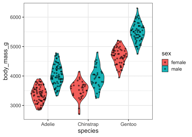
Grouped Violin Plot with jittered data using geom_sina() from ggforce
A better option to make grouped violin plot with jittered data points is to use geom_sina() from ggforce R package on top of violin plot. The biggest advantage we get is that the data points by geom_sina() follows the shape of violin plot, spreading out where there are more points.
penguins |>
  drop_na() |>
  ggplot(aes(x=species,
             y=body_mass_g,
             fill=sex))+
  geom_violin()+
  geom_sina(alpha=0.5)
ggsave("grouped_violin_plot_with_jittered_points_geom_sina_ggforce.png")
Another advantage is that jittered data points is aligned well with the groups.
Explore the Complete ggplot2 Guide
35+ tutorials with code: scatterplots, boxplots, themes, annotations, facets, and more—tested and beginner-friendly.
Visit the ggplot2 Hub → No fluff—just code and visuals.


