In this tutorial, we will learn how to add water marks to a plot made in R. We will use ggplot2 to make the plot and use the R package cowplot to add water mark on top the plot.
The cowplot package developed by Claus Wilke
functions to draw with and on plots. These functions enable us to take plots and add arbitrary annotations or backgrounds, to place plots inside of other plots, to arrange plots in more complicated layouts, or to combine plots from different graphic systems (ggplot2, grid, lattice, base). This functionality is build on top of ggplot2, i.e., the resulting plots are ggplot2 objects and they can be modified, extended, and outputted just like regular ggplot2 plots.
In case if you wonder about the package name,
The package was originally written for internal use in the Wilke lab, hence the name (Claus O. Wilke’s plot package). It has also been used extensively in the book Fundamentals of Data Visualization.
Let us get started by loading the R packages needed to make a plot with watermark.
library(tidyverse)
library(palmerpenguins)
library(cowplot)
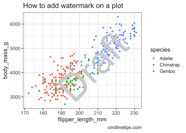
We use palmer penguins dataset to make a simple scatter plot with ggplot.
p <- penguins %>%
  ggplot(aes(x = flipper_length_mm,
             y = body_mass_g,
             color = species))+
  geom_point()+
  labs(title= "How to add watermark on a plot",
       caption="cmdlinetips.com")+
  theme_bw(16)
print(p)
ggsave("simple_scatterplot_with_ggplot2.png")

And we want to add water mark label on top of the scatterplot. The R package cowplot offers multiple functions to add annotation on top of the plot.
A key function from cowplot to add annotation is ggdraw() and we apply this function on the ggplot object and then use draw_label() to add the water mark on top of the plot. We can customize the text, color, size and the angle of watermark using the arguments shown below.
ggdraw(p) +
  draw_label("Draft",
             color = "lightgray",
             size = 100,
             angle = 45)
ggsave("how_to_add_watermark_on_ggplot2_using_cowplot.png")
And we get this nice plot with watermark on it.
Thanks to the fantastic documentation of cowplot package, instead of using the draw_label() function to add water mark to a plot we can use ggplot2 function geom_text() as shown below.
ggdraw(p) +
 geom_text(
    data = data.frame(x = 0.5,
                      y = 0.5, label = "Draft"),
    aes(x, y, label = label),
    hjust = 0.5, vjust = 0.5, angle = 45, size = 100/.pt,
    color = "lightgray",
    inherit.aes = FALSE
  )
ggsave("how_to_add_watermark_on_ggplot2_using_geom_text.png")

Explore the Complete ggplot2 Guide
35+ tutorials with code: scatterplots, boxplots, themes, annotations, facets, and more—tested and beginner-friendly.
Visit the ggplot2 Hub → No fluff—just code and visuals.


