Last updated on August 14, 2025
Bump plots are line plots with dots showing the data points. Bump plots can be useful in understanding the change in rank over time. In this tutorial, we will learn how to make bump plots using ggbump package, a ggplot2 extension package.
To make a bump plot we will use the top browser usage over time. First, let us get started creating the dataframe with browser usage percentages of the most commonly used web browsers like Chrome, Firefox, Safari and IE.
We will create vectors containing the data for each browser.
years <- c(2007,2010,2013,2016,2019)
chrome <- c(0, 10.6, 33.4, 59.5, 56.1)
safari <- c(2.4, 2.1, 15.2, 13.1,18.1)
IE <- c(67.7, 48.3, 23, 10.2,7.5)
firefox <- c(25,34.1,19.1,10.1,5.5)
opera <- c(1.8,2.3,2.4,2.6,3.7)
Then use tibble() function to create a tibble/dataframe in a wide form.
df <- tibble(year=years,
             Chrome=chrome/100,
             Safari=safari/100,
             IE=IE/100,
             Firfox=firefox/100,
             Opera=opera/100)

## # A tibble: 5 × 6
##    year Chrome Safari    IE Firfox Opera
##   <dbl>  <dbl>  <dbl> <dbl>  <dbl> <dbl>
## 1  2007  0      0.024 0.677  0.25  0.018
## 2  2010  0.106  0.021 0.483  0.341 0.023
## 3  2013  0.334  0.152 0.23   0.191 0.024
## 4  2016  0.595  0.131 0.102  0.101 0.026
## 5  2019  0.561  0.181 0.075  0.055 0.037
Using pivot_longer() we reshape the data in wide form to long tidy form.
df_long <- df %>%
  pivot_longer(-year, names_to = "browser", values_to="usage_share" )

df_long %>% head()
## # A tibble: 6 × 3
##    year browser usage_share
##   <dbl> <chr>         <dbl>
## 1  2007 Chrome        0
## 2  2007 Safari        0.024
## 3  2007 IE            0.677
## 4  2007 Firfox        0.25
## 5  2007 Opera         0.018
## 6  2010 Chrome        0.106
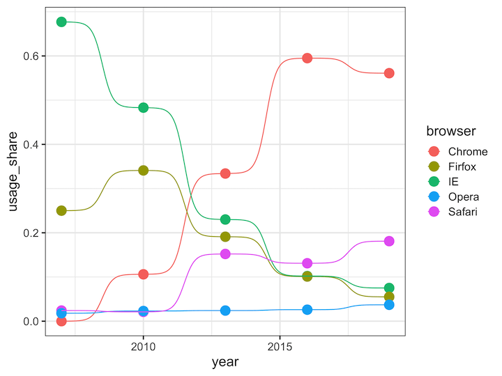
bump plot with ggbump
ggbump package has a geom, geom_bump, for making bump plot. We first use geom_point() and then add the geom_bump() layer.
df_long %>%
  ggplot(aes(year, usage_share, color = browser)) +
  geom_point(size = 5) +
  geom_bump()
ggsave("bump_plot_ggbump.png", width=8, height=6)
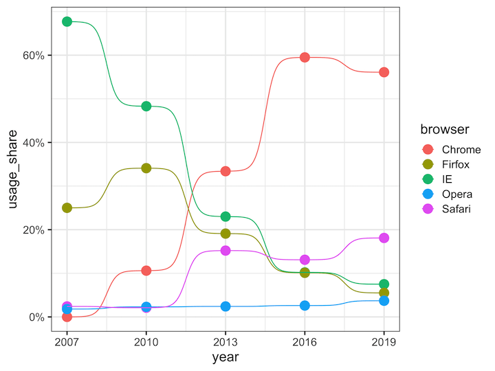
Customizing bump plot
Here we customize the x and y axes, first we use scales package to add percent sign on y-axis and then specify breaks on x-axis.
df_long %>%
  ggplot(aes(year, usage_share, color = browser)) +
  geom_point(size = 5) +
  geom_bump() +
  scale_y_continuous(labels = scales::percent)+
  scale_x_continuous(breaks=c(2007,2010,2013,2016,2019))
ggsave("bump_plot_ggbump_customize.png", width=8, height=6)
Check out ggbump’s github page to learn other intersting uses of bump chart in R
Explore the Complete ggplot2 Guide
35+ tutorials with code: scatterplots, boxplots, themes, annotations, facets, and more—tested and beginner-friendly.
Visit the ggplot2 Hub → No fluff—just code and visuals.


