Last updated on January 20, 2022
In this post we will learn how to make a random jitter plots made with ggplot2 reproducible. We have multiple posts on the importance of showing the actual data points while making boxplots/violinplots. One of the ways to avoid overplotting, is to add random jitters on the x-axis to the data points, so they all don’t overlap on each other. The best way to add the random jitters on a boxplot is to make them reproducible, so they look exactly the same no matter when you rand and generated the plot.
H/T to Tom Mock, who shared the really useful #rstats #ggplot2 tip on how to make a plot with random jitters reproducible. You guessed it, we need to set a seed for random jitter. And the way to set seed is to use position_jitter() and specify see inside it as argument.
Let us get started with loading the packages we will be using.
library(tidyverse)
library(palmerpenguins)
library(patchwork)
theme_set(theme_bw(16))
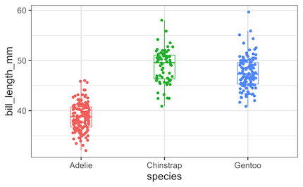
penguins %>%
  ggplot(aes(x = species,
             y = bill_length_mm,
             color = species))+
  geom_boxplot(width=0.25,
               outlier.shape = NA)+
  geom_jitter(width=0.1)+
  theme(legend.position="none")
ggsave("boxplot_with_jittered_points_ggplot2.png")
How to make Boxplots with reproducible jittered points
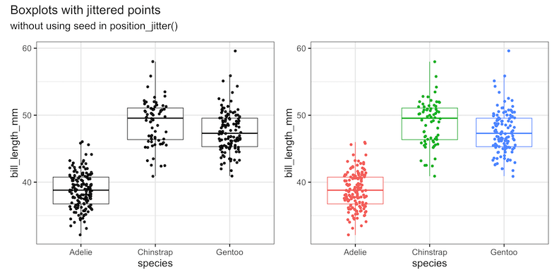
First, let us try to make two variations of the same plot with position_jitter(). In the first plot we did not add any color to the plot.
p1 <- penguins %>%
  ggplot(aes(x=species,y=bill_length_mm))+
  geom_boxplot(outlier.shape = NA)+
  geom_point(position = position_jitter(seed = 42,width=0.15))+
  theme(legend.position = "none")
In the second plot, we have colored the data points by species. Otherwise they both are the same plot.
p2 <- penguins %>%
  ggplot(aes(x=species,y=bill_length_mm, color=species))+
  geom_boxplot(outlier.shape = NA)+
  geom_point(position = position_jitter(width=0.15))+
  theme(legend.position = "none")
p1+p2+ plot_annotation(
  title = 'Boxplots with jittered points',
  subtitle="without using seed in position_jitter()")
If we carefully look at the data points in these two plots, we can see that the original plot is not reproducible.
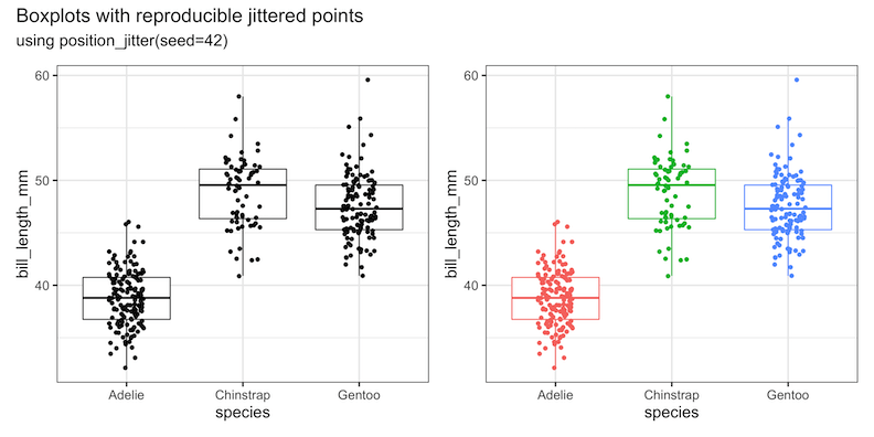
To make a boxplot with reproducible jittered data points, we will be using geom_point() function on top of the geom_boxplot() function as before. Inside geom_point() function, we use position argument with value position_jitter(seed = 42) to make the jittered points reproducible.
Let us try reproducing the same plot, but with slightly different color options, but with the same seed inside position_jitter() function.
p3 <- penguins %>%
  ggplot(aes(x=species,y=bill_length_mm, color=species))+
  geom_boxplot(outlier.shape = NA)+
  geom_point(position = position_jitter(seed = 42,width=0.15))+
  theme(legend.position = "none")
We can combine these two plots to make the comparison.
p1 + p3+ plot_annotation(
  title = 'Boxplots with reproducible jittered points',
  subtitle='using position_jitter(seed=42)')
We can clearly see that the jittered data points are reproducible.
If we make the boxplot with jittered points, without the seed argument we will a get plot similar to the one below, but not reproducible.
Explore the Complete ggplot2 Guide
35+ tutorials with code: scatterplots, boxplots, themes, annotations, facets, and more—tested and beginner-friendly.
Visit the ggplot2 Hub → No fluff—just code and visuals.


