Last updated on October 27, 2025
In this tutorial, you’ll learn four easy ways to remove legend titles in ggplot2 using scale_fill_discrete(), scale_fill_manual(), guides() with guide_legend(), and theme(legend.title = element_blank()).
Each method works slightly differently depending on whether your legend comes from fill or color. We’ll start with a barplot example and end with a universal one-line fix that works in any ggplot2 chart.
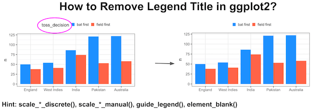
And finally recommend using theme()’s element_blank() as it gives a general solution that works nicely with other customization of a plot made with ggplot2.
Load packages and data needed
library(tidyverse)
theme_set(theme_bw(16))
We will use Cricket World Cup data from TidyTuesday to make a barplot with legends. Let us load the data from TidyTuesday’s github page.
matches <- readr::read_csv('https://raw.githubusercontent.com/rfordatascience/tidytuesday/master/data/2021/2021-11-30/matches.csv')
## # A tibble: 6 × 24
##   match_id   team1        team2 score_team1 score_team2 wickets_team2 wickets_team
##   <chr>      <chr>        <chr>       <dbl>       <dbl>         <dbl>        <dbl>
## 1 ODI # 1028 West Indies  Aust…         172         173             9            9
## 2 ODI # 1029 West Indies  Sri …         194         124            10           10
## 3 ODI # 1030 Sri Lanka    West…         102         104            10            3
## 4 ODI # 1031 West Indies  Aust…         231         217            10           10
## 5 ODI # 1032 Australia    Sri …         213         214             5            7
## 6 ODI # 1033 South Africa Engl…         211         205             8           10
## # … with 17 more variables: team1_away_or_home <chr>, team2_home_away <chr>,
## #   winner <chr>, margin <dbl>, margin_type <chr>, time_of_day <chr>,
## #   series <chr>, player_of_match <chr>, player_of_match_team <chr>,
## #   venue <chr>, toss <chr>, toss_decision <chr>, ball_remaining <chr>,
## #   ground <chr>, ground_city <chr>, ground_country <chr>, match_date <chr>
To make it simple let us create a simple table with number of matches won by top teams and information on if they batted or fielded first.
winners_df <- matches |>
  count(winner,toss_decision) |>
  filter(winner %in% c("Australia","England", "India","New Zealand",
                       "Pakistan", "Sri Lanka","West Indies", "South Africa")) |>
  mutate(winner=fct_reorder(winner,n))
The data we will be using to make the barplot is this.
winners_df

## # A tibble: 16 × 3
##    winner       toss_decision     n
##    <fct>        <chr>         <int>
##  1 Australia    bat first       122
##  2 Australia    field first      58
##  3 England      bat first        50
##  4 England      field first      38
##  5 India        bat first        86
##  6 India        field first      74
##  7 New Zealand  bat first        47
##  8 New Zealand  field first      54
##  9 Pakistan     bat first       121
## 10 Pakistan     field first      53
## 11 South Africa bat first       108
## 12 South Africa field first      69
## 13 Sri Lanka    bat first        80
## 14 Sri Lanka    field first      74
## 15 West Indies  bat first        54
## 16 West Indies  field first      41
A ggplot with legend title
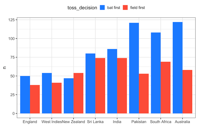
First, we will make a barplot with winning team on x-axis and the number of wins on the y-axis. We fill the bars with colors based on the toss_decision, i.e if they batted first or fielded first to see how it contributed to a team’s winning.
winners_df |>
  ggplot(aes(x = winner,
             y = n,
             fill = toss_decision))+
  geom_col(position="dodge")+
  labs(x="")+
  theme(legend.position="top")+
  scale_fill_manual( values = c("bat first"="dodgerblue",
                                "field first"="tomato" ))
ggsave("ggplot_with_legend_title.png",width=8, height=6)
We can see that legend has title text with the variable name.
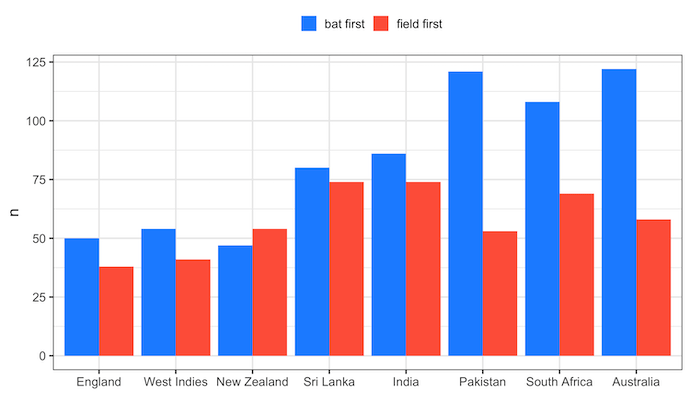
1. Remove legend title using scale_fill_discrete()
One of the ways to remove legend title is to use scale_fill_discrete() function with name=”” as argument. Here we use scale_fill_discrete() as we have the legend from “fill” argument while making barplots.
winners_df |>
  ggplot(aes(x = winner,
             y = n,
             fill = toss_decision))+
  geom_col(position="dodge")+
  labs(x="")+
  theme(legend.position="top")+
  scale_fill_discrete(name=NULL)
 # scale_fill_discrete(name="")
ggsave("remove_legend_title_scale_fill_discrete.png", width=8, height=6)
If we are not using fill option, but use color option in our plot, then we can use scale_color_discrete() function to remove legend title.
2. Remove legend title using scale_fill_manual()
The second example we will see to remove legend title in a plot made with ggplot2 is to use scale_fill_manual() function. In the original barplot we had used scale_fill_manual() function to specify colors for barplot. Now we can add name=”” as argument to remove legend title.
winners_df |>
  ggplot(aes(x = winner,
             y = n,
             fill = toss_decision))+
  geom_col(position="dodge")+
  labs(x="")+
  theme(legend.position="top")+
  scale_fill_manual(values = c("bat first"="dodgerblue",
                               "field first"="tomato"),
                    name=NULL)
  #scale_fill_manual(values = c("bat first"="dodgerblue", "field first"="tomato"),
  #                  name="")
ggsave("remove_legend_title_with_scale_fill_manual.png",
       width=8,
       height=6)

If our plot does use using fill option, but uses color option, then we can use scale_color_manual() function to remove legend title in R.
3. Remove legend title using guide_legend()
The third function we can use to remove legend title in ggplot2 is to use guide_legend() function with title=NULL within guides() function as show below.
winners_df |>
  ggplot(aes(x = winner,
             y = n,
             fill = toss_decision))+
  geom_col(position="dodge")+
  labs(x="")+
  theme(legend.position="top")+
  scale_fill_manual(values = c("bat first"="dodgerblue", "field first"="tomato" ))+
  guides(fill=guide_legend(title=NULL))
ggsave("remove_legend_title_with_scale_guide_legend.png",width=8, height=6)

If the plot has legend due to color option, we will use “color” argument to guides() function instead of fill argument.
4. Remove legend title in ggplot2 using element_blank() in theme()
Fourth way to remove title text in the legend is to use theme() function and specify legend.title=element_blank().
winners_df  |>
  ggplot(aes(x = winner,
             y = n,
             fill = toss_decision))+
  geom_col(position="dodge")+
  labs(x="")+
  theme(legend.position="top",
        legend.title=element_blank())+
  scale_fill_manual(values = c("bat first"="dodgerblue", "field first"="tomato" ))
ggsave("remove_legend_title_with_theme_element_blank.png",width=8, height=6)
Remove legend title in any ggplot2 using element_blank() in theme()
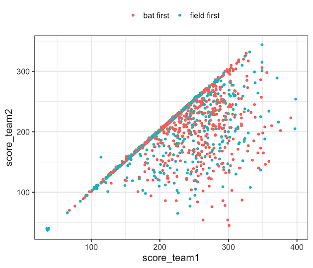
One of the advantages of using theme() and element_blank() to remove legend title is that it provides a general solution. For example, we can use the same state remove legend title from scatter plot that uses “color” to add legend. In addition, theme() function gives great flexibility to further customize a plot made with ggplot2.
matches |>
  filter(winner %in% c("Australia","England", "India","New Zealand",
                       "Pakistan", "Sri Lanka","West Indies", "South Africa")) %>%
  ggplot(aes(score_team1, score_team2, color=toss_decision)) +
  geom_point()+
  theme(legend.position="top",
        legend.title=element_blank())
ggsave("remove_legend_title_on_scatterplot_with_theme_element_blank.png",
       width=7, height=6)
Frequently Asked Questions
1. How do I remove the legend title globally in ggplot2?
Add + theme(legend.title = element_blank()) to your plot — this removes all legend titles regardless of the aesthetic.
2. How can I remove the legend title for color instead of fill?
Use scale_color_manual(name = NULL) or guides(color = guide_legend(title = NULL)) for color-based legends.
3. What’s the simplest one-line fix?
The most general fix is + theme(legend.title = element_blank()); it works for any legend type in ggplot2.
Related tutorials:
Explore the Complete ggplot2 Guide
35+ tutorials with code: scatterplots, boxplots, themes, annotations, facets, and more—tested and beginner-friendly.
Visit the ggplot2 Hub → No fluff—just code and visuals.


