Last updated on August 13, 2025
In this tutorial, we’ll explore how to visualize stock prices of multiple companies over time using R and ggplot2. Stock data is a classic example of time series data, where each company’s price changes over a period. We’ll start by retrieving stock prices for the companies you’re interested in and then create a clear, visualization, easy-to-read line plot, to compare multiple companies’ stock performance over time.
Let us load the packages needed.
library(tidyquant)
library(tidyverse)
theme_set(theme_bw(16))
Since we are interested in multiple companies’ stock price, let us create a vector containing the ticker names of the companies.
tickers <- c("MSFT","FB","AAPL")
We can use tidyquant’s tq_get() function to get the stock prices of multiple companies in the same was as a single company.
stock_df <- tq_get(tickers,
                          get = "stock.prices",
                          from = "2015-01-01",
                          to = "2021-12-31")
stock_df %>% head()
## # A tibble: 6 × 8
##   symbol date        open  high   low close   volume adjusted
##   <chr>  <date>     <dbl> <dbl> <dbl> <dbl>    <dbl>    <dbl>
## 1 MSFT   2015-01-02  46.7  47.4  46.5  46.8 27913900     41.2
## 2 MSFT   2015-01-05  46.4  46.7  46.2  46.3 39673900     40.8
## 3 MSFT   2015-01-06  46.4  46.8  45.5  45.7 36447900     40.2
## 4 MSFT   2015-01-07  46.0  46.5  45.5  46.2 29114100     40.7
## 5 MSFT   2015-01-08  46.8  47.8  46.7  47.6 29645200     41.9
## 6 MSFT   2015-01-09  47.6  47.8  46.9  47.2 23944200     41.6
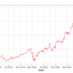
To make the line plot or time series plot for multiple companies, we specify color argument and specify the ticker names to plot different companies in different color.
stock_df %>%
  ggplot(aes(x=date, y=adjusted,  color=symbol))+
  geom_line()
ggsave("multi_company_stock_prices_over_time.png")
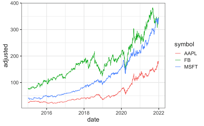
We can further customize the colors using scale_color_brewer() as another layer with a specific palette of interest.
stock_df %>%
  ggplot(aes(x=date, y=adjusted,  color=symbol))+
  geom_line(size=1)+
  scale_color_brewer(palette = "Set2")
ggsave("customizing_colors_stock_prices_over_time.png")

Explore the Complete ggplot2 Guide
35+ tutorials with code: scatterplots, boxplots, themes, annotations, facets, and more—tested and beginner-friendly.
Visit the ggplot2 Hub → No fluff—just code and visuals.