Last updated on November 23, 2025
Heatmaps are a powerful way to visualize multi-dimensional data. By representing numerical values as colors within a matrix, heatmaps allow us to spot patterns, clusters, and outliers instantly. For example, you might visualize high values in a dark color and low values in a light color, making data trends immediately apparent to the human eye.
In this tutorial, we will learn how to create heatmaps in R using the popular ggplot2 package. We will explore two specific geometric objects: geom_tile() and geom_raster()
ggplot2 has two geoms, geom_tile() and geom_raster(), that can help up make simple heatmaps quickly.
In our first example, we will use gapminder which already in long tidy form to make heatmap using either geom_tile() or geom_raster().
Let us first load tidyverse and gaominder data
library(tidyverse)
library(gapminder)
Preparing the Data
We will analyze the change in Life Expectancy and GDP per Capita over time. Let’s look at the gapminder dataset, which is already in the “tidy” (long) format required by ggplot2.
head(gapminder)

## # A tibble: 6 x 6
##   country     continent  year lifeExp      pop gdpPercap
##   <fct>       <fct>     <int>   <dbl>    <int>     <dbl>
## 1 Afghanistan Asia       1952    28.8  8425333      779.
## 2 Afghanistan Asia       1957    30.3  9240934      821.
## 3 Afghanistan Asia       1962    32.0 10267083      853.
## 4 Afghanistan Asia       1967    34.0 11537966      836.
## 5 Afghanistan Asia       1972    36.1 13079460      740.
## 6 Afghanistan Asia       1977    38.4 14880372      786.
For our first example, let’s subset the data to focus only on African countries. We will also convert the year column to a factor so that ggplot2 treats it as a discrete category on the X-axis rather than a continuous number.
df1 <- gapminder |>
  filter(continent %in% c("Africa")) |>
  mutate(year=factor(year))
Method 1: Creating a Heatmap with geom_raster()
The geom_raster() function is highly efficient and is the preferred method when your tiles are the same size. It renders significantly faster than other methods, which is helpful if you have a massive dataset.
To build the plot, we map:
- X-axis: Year
- Y-axis: Country
- Fill: Life Expectancy (lifeExp)
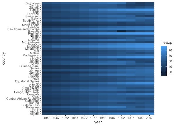
df1 |>
  ggplot(aes(y=country, x=year, fill=lifeExp)) +
  geom_raster()
By default, ggplot2 uses a continuous blue color scale. Darker blues represent higher life expectancy, while lighter blues represent lower values
Method 2: Creating a Heatmap with geom_tile()
The geom_tile() function works almost exactly like geom_raster(). The primary difference is that geom_tile() is slower but more flexible—it allows for tiles of uneven sizes.
If your data grid is uniform, the output will look identical to the raster version:
df1 |>
  ggplot(aes(y=country, x=year, fill=lifeExp)) +
  geom_tile()
And the heatmap made with geom_tile() looks exactly the same as before.

Pro Tip: If your dataset has thousands of rows, use geom_raster() for faster rendering. If your dataset is small or has irregular spacing, use geom_tile().
Customizing Heatmap Colors
The default blue scale can be difficult to read. To make our heatmap truly insightful, we should use a color palette designed for continuous data. The Viridis palette is a popular choice in the R community because it is colorblind-friendly and prints well in black and white.
Example 1: Life Expectancy in Africa
Let’s apply scale_fill_viridis_c() to our African Life Expectancy map.
df1 |>
  ggplot(aes(y = country,
             x = year,
             fill = lifeExp)) +
  geom_raster() +
  scale_fill_viridis_c(option = "magma") + # "magma" is a variation of viridis
  labs(title = "Life Expectancy in Africa (1952-2007)",
       y = "Country",
       x = "Year",
       fill = "Life Exp.")
ggsave("ggplot2_heatmap_color_scale_fill_virdis.png", height=7, width=6)
Now the heatmap looks much better and we can clearly see the differences over time in life expectancy for countries.
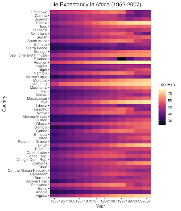
With this color scheme, the patterns become obvious. We can clearly see the general trend of increasing life expectancy across the continent over the decades.
Example 2: GDP per Capita in the Americas
Let’s try a different metric. We will visualize GDP per Capita for countries in the Americas.
First, we prepare the data:
Here is another example of adding colors to a heatmap with ggplot2. In this example, we use data from America.
df2 <- gapminder |>
  filter(continent %in% c("Americas")) |>
  mutate(year = factor(year))
Now, we plot using the default Viridis scale:
df2 |>
  ggplot(aes(y = country, x = year, fill = gdpPercap)) +
  geom_raster() +
  scale_fill_viridis_c() +
  theme_minimal() +
  labs(title = "GDP per Capita in the Americas",
       fill = "GDP")
ggsave("ggplot2_heatmap_color_default_scale_fill_virdis.png", height=7, width=6)
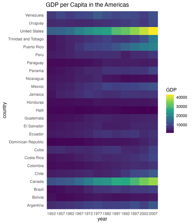
This visualization highlights economic disparities effectively. Countries with consistently high GDP (like the US and Canada) stand out in bright yellow/green, while lower GDP ranges remain in purple/blue.
Improving Readability: Reordering the Y-Axis
By default, ggplot2 orders the Y-axis alphabetically (e.g., starting with Algeria, Angola, Benin…). While this is organized, it doesn’t help us see patterns in the data.
To make the heatmap more insightful, we should order the countries based on their value. For example, we can rank countries from highest average Life Expectancy to lowest. We can do this easily using the fct_reorder() function from the forcats package (which is loaded automatically with tidyverse).
# Reorder country based on the median Life Expectancy
df1_sorted <- df1 |>
  mutate(country = fct_reorder(country, lifeExp))
# Plot with the new order
df1_sorted |>
  ggplot(aes(y = country, x = year, fill = lifeExp)) +
  geom_raster() +
  scale_fill_viridis_c(option = "magma") +
  theme_minimal() +
  labs(title = "African Life Expectancy (Sorted)",
       y = "Country",
       x = "Year",
       fill = "Life Exp.")
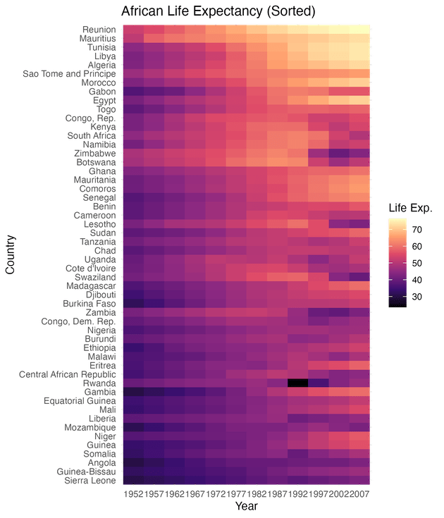
Notice how the heatmap now looks like a smooth gradient rather than a scattered mosaic? The countries with the highest life expectancy are now grouped at the top, and those with the lowest are at the bottom. This makes it instantly easy to identify which countries are performing best and which are struggling, without reading every single label.
Adding Borders and Small Multiples
One of the ways to make the heatmap look crisp and separate the individual tiles, we can add a thin white border around every tile. Note that we must use geom_tile() (not raster) to use the color argument effectively.
In the example below we show how to compare multiple groups in R heatmap. It leverages ggplot2’s strongest feature, i.e. visualizing small multiples using facet_wrap().
What if we want to compare Africa and Europe side-by-side? Instead of filtering for just one continent, we can filter for two and use facet_wrap() to create separate heatmaps for each.
# Filter for two continents
df_comparison <- gapminder |>
  filter(continent %in% c("Africa", "Europe")) |>
  mutate(year = factor(year))
df_comparison |>
  ggplot(aes(y = country,
             x = year,
             fill = lifeExp)) +
  geom_tile(color = "white", lwd = 0.2) +
  scale_fill_viridis_c() +
  facet_wrap(~continent, scales = "free_y") + # Separate panels
  theme(axis.text.y = element_text(size = 5))
ggsave("ggplot2_heatmap_facet_wrap_example.png", width=10, height=6)