Last updated on September 9, 2021
In this tutorial, we will learn how to change the axis title bold font with ggplot2 in R. Let us load the packages needed including tidyverse and palmerpenguins for penguins data.
library(tidyverse)
library(palmerpenguins)
theme_set(theme_bw(16))
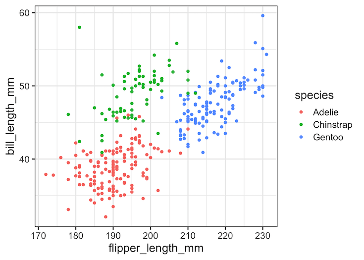
A plot with default font for axis title text
Let us make a simple scatter plot using ggplot2 to see how the default font for both x and y-axis title looks like.
penguins %>%
  drop_na() %>%
  ggplot(aes(x = flipper_length_mm,
             y = bill_length_mm,
             color = species)) +
   geom_point()
ggsave("how_to_make_axis_title_bold_font_ggplot2.png")
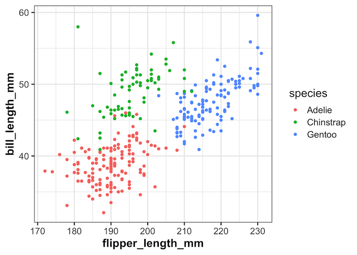
Make Axis Title Text Bold Font with element_text()
We can change the appearance text elements of a plot made with ggplot2 using theme element element_text() function. To make both x and y-axis’s title text in bold font, we will use axis.title argument to theme() function with element_text(face=”bold”).
penguins %>%
  drop_na() %>%
  ggplot(aes(x = flipper_length_mm,
             y = bill_length_mm,
             color = species)) +
   geom_point() +
  theme(axis.title = element_text(face="bold"))
ggsave("make_axis_title_bold_font_ggplot2.png")
Note now both x and y axis’s title text are in bold font.
Make X and Y Axis Title Text Bold Font Separately with element_text()
In the above example, we changed both x and y-axis’s title text into bold. We can also specify either x or y-axis alone to customize the look of text using element_text(). For example, to make the title text of x-axis aloine in bold font, we will use “axis.title.x”
penguins %>%
  drop_na() %>%
  ggplot(aes(x = flipper_length_mm,
             y = bill_length_mm,
             color = species)) +
   geom_point() +
  theme(axis.title.x = element_text(face="bold"))
Similarly, to make the y-axis title text’s font into bold we can use “axis.title.y” as shown below.
penguins %>%
  drop_na() %>%
  ggplot(aes(x = flipper_length_mm,
             y = bill_length_mm,
             color = species)) +
   geom_point() +
  theme(axis.title.y = element_text(face="bold"))
Explore the Complete ggplot2 Guide
35+ tutorials with code: scatterplots, boxplots, themes, annotations, facets, and more—tested and beginner-friendly.
Visit the ggplot2 Hub → No fluff—just code and visuals.


