Last updated on January 20, 2022
Pair plot is a simple way to quickly visualize the relationship between multiple variables in a dataframe. In this post, we will learn how to make a simple pair plot from scratch between a few quantitative/numerical variables using basic tidyverse functions. (H/T to a twitter user who did something very similar to this for the inspiration)
Pair plot is often useful when there are just a few variables in the dataframe. As you will see in this tutorial even with four variables, Pair plot is slightly difficult to gain as much information as possible.
To make pairplot from scratch, we will use Palmer Penguins dataset and at first use its numerical variables.
library(palmerpenguins)
library(tidyverse)
The most important step in making a pairplot from scratch is to get the data in the right form and then use ggplot2 to make the pairplot.
Simple Pair Plot from scratch with R
To start with, let us focus on select numerical variables. An important step is to create a unique row number and add it as a column.
df <- penguins %>%
  rowid_to_column() %>%
  mutate(year=factor(year)) %>%
  select(where(is.numeric))
Now we have the simiplified data ready. Let us reshape the data in wide form to long form with pivot_longer() by keeping the row number.
df %>%
  pivot_longer(cols = -rowid)

## # A tibble: 1,376 x 3
##    rowid name               value
##    <int> <chr>              <dbl>
##  1     1 bill_length_mm      39.1
##  2     1 bill_depth_mm       18.7
##  3     1 flipper_length_mm  181
##  4     1 body_mass_g       3750
##  5     2 bill_length_mm      39.5
##  6     2 bill_depth_mm       17.4
##  7     2 flipper_length_mm  186
##  8     2 body_mass_g       3800
##  9     3 bill_length_mm      40.3
## 10     3 bill_depth_mm       18
## # … with 1,366 more rows
A neat trick to create the data for making pairplot is to use the full_join() on the tidy dataframe itself by the row number we created. This creates a tibble with all possible pairs of column names and their values. Note that since we used join on the dataframe with itself, we have the same column names and full_join() statement has created variables with suffix x & y.
df %>%
  pivot_longer(cols = -rowid) %>%
  full_join(., ., by = "rowid")
## # A tibble: 5,504 x 5
##    rowid name.x            value.x name.y            value.y
##    <int> <chr>               <dbl> <chr>               <dbl>
##  1     1 bill_length_mm       39.1 bill_length_mm       39.1
##  2     1 bill_length_mm       39.1 bill_depth_mm        18.7
##  3     1 bill_length_mm       39.1 flipper_length_mm   181
##  4     1 bill_length_mm       39.1 body_mass_g        3750
##  5     1 bill_depth_mm        18.7 bill_length_mm       39.1
##  6     1 bill_depth_mm        18.7 bill_depth_mm        18.7
##  7     1 bill_depth_mm        18.7 flipper_length_mm   181
##  8     1 bill_depth_mm        18.7 body_mass_g        3750
##  9     1 flipper_length_mm   181   bill_length_mm       39.1
## 10     1 flipper_length_mm   181   bill_depth_mm        18.7
## # … with 5,494 more rows
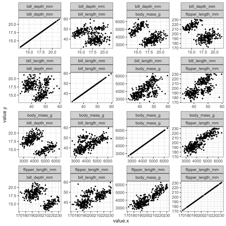
Now we are ready to make a simple pair plot and the key is to use facet_wrap on the x and y variables. Here wewe use geom_point() to make scatter plot.
df %>%
  pivot_longer(cols = -rowid) %>%
  full_join(., ., by = "rowid") %>%
  ggplot( aes(x = value.x, y = value.y)) +
  geom_point() +
  facet_wrap(name.x ~ name.y, scales = "free")

Pairplot from scratch with tidyverse: Add color by a variable
Although the simple above pairplot can be useful, often we may have other categorical variables associated with the data. And one might like to add color to the data points on the scatterplot based on the value of the categorical variable.
Since we have created the data containing numerical variables in the above example, let us build on the data. Using a rude way, we add the categorical variable by joining it with the dataframe that we used to make pair plot above.
df %>%
  pivot_longer(cols = -rowid)  %>%
  full_join(.,  ., by = "rowid") %>%
  left_join(penguins %>%
              rowid_to_column() %>%
              select(rowid,species))
Notice that now the data for plotting pairplot also contain species variable.
## Joining, by = "rowid"
## # A tibble: 5,504 x 6
##    rowid name.x            value.x name.y            value.y species
##    <int> <chr>               <dbl> <chr>               <dbl> <fct>
##  1     1 bill_length_mm       39.1 bill_length_mm       39.1 Adelie
##  2     1 bill_length_mm       39.1 bill_depth_mm        18.7 Adelie
##  3     1 bill_length_mm       39.1 flipper_length_mm   181   Adelie
##  4     1 bill_length_mm       39.1 body_mass_g        3750   Adelie
##  5     1 bill_depth_mm        18.7 bill_length_mm       39.1 Adelie
##  6     1 bill_depth_mm        18.7 bill_depth_mm        18.7 Adelie
##  7     1 bill_depth_mm        18.7 flipper_length_mm   181   Adelie
##  8     1 bill_depth_mm        18.7 body_mass_g        3750   Adelie
##  9     1 flipper_length_mm   181   bill_length_mm       39.1 Adelie
## 10     1 flipper_length_mm   181   bill_depth_mm        18.7 Adelie
## # … with 5,494 more rows
Let us go ahead and make pair plot as we did before, but this time we have colored the points by the categorical variable of interest.
df %>%
  pivot_longer(cols = -rowid) %>%
  full_join(., ., by = "rowid") %>%
  left_join(penguins %>%
              rowid_to_column() %>%
              select(rowid, species)) %>%
  ggplot(aes(x = value.x, y = value.y, color=species)) +
   geom_point(alpha = 0.5) +
   facet_wrap(name.x ~ name.y, scales = "free")+
  theme(axis.title = element_blank(),
        legend.position = "bottom")
To make the plot look better, we have removed the axis titles and move the legend to the bottom of the plot.

Pairplot from scratch with tidyverse: Add color and shape by variables
A better way to to add color (and shape ) by variable is to use the original data with categorical variable and use join statement just once. And this would create additional variables with the same name. For example, for the categorical variable “species”, now we have “species.x” and “species.y”.
We can pick one of them to add color/shape by variable.
penguins %>%
  drop_na() %>%
  rowid_to_column() %>%
  mutate(year = factor(year)) %>%
  pivot_longer(cols = -c(rowid, species, island, year, sex)) %>%
  full_join(., ., by = "rowid") %>%
  ggplot(aes(x = value.x,
             y = value.y,
             color = species.x,
             shape = sex.x)) +
   geom_point() +
  facet_wrap(name.x ~ name.y, scales = "free")+
  theme(axis.title = element_blank(),
        legend.position = "bottom")+
  labs(color='Species', shape="Sex")
In addition to adding color and shape by two variables we have also changed the legend titles using labs() function.

Explore the Complete ggplot2 Guide
35+ tutorials with code: scatterplots, boxplots, themes, annotations, facets, and more—tested and beginner-friendly.
Visit the ggplot2 Hub → No fluff—just code and visuals.


