Last updated on June 8, 2021
In this tutorial, we will learn how to annotate a plot with circle to highlight a select portion of a plot made with ggplot2 in R. There are a few options to add a circle on top of a plot with ggplot2. In this example, we will annotate a plot with a circle at a specific location and radius. We will use ggforce’s geom_circle() function to annotate a plot made with ggplot2 with a circle.
Let us load the packages needed. We will use Palmer penguin dataset to make a scatter plot and annotate it with a circle.
library(tidyverse)
library(palmerpenguins)
theme_set(theme_bw(16))
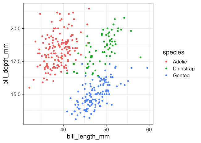
First, let make a scatterplot using ggplot2’s geom_point().
penguins %>%
  ggplot(aes(x=bill_length_mm,
             y=bill_depth_mm,
             color=species))+
  geom_point()
Let us say we want to highlight a portion of the scatter plot at a scpecific coordinate (x,y) with a circle of radius r. We can use geom_circle() function from ggforce to draw a circle on top of the scatterplot at the specific location. ggforce geom_circle() function’s aes() takes in the location of the center of the circle, the x and y coordinate and radius of the circle.
penguins %>%
ggplot(aes(x = bill_length_mm,
y = bill_depth_mm,
color = species))+
geom_point()+
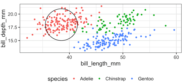
geom_circle(aes(x0 = 38.5, y0 = 18, r = 3),
inherit.aes = FALSE)
ggsave("annotating_plot_with_circle.png")
geom_circle() annotates the plot with the circle at the given location. Note that even though we specified a circle with a radius, the resulting plot has an ellipse.

The reason for annotating with ellispe instead of circle is because our x and y axes’ ranges are very different. ggforce’s geom_circle() is
intended for cartesian coordinate systems and will only produce a true circle if ggplot2::coord_fixed() is used.
So, let us add coord_fixed() to fix the aspect ratio of the plot.
penguins %>%
  ggplot(aes(x = bill_length_mm,
             y = bill_depth_mm,
             color = species))+
  geom_point()+
  geom_circle(aes(x0 = 38.5, y0 = 18, r = 3),
              inherit.aes = FALSE)+
  coord_fixed()
ggsave("annotating_plot_with_circle_coord_fixed.png")
Now we have annotated the plot with a circle as we aimed.
Explore the Complete ggplot2 Guide
35+ tutorials with code: scatterplots, boxplots, themes, annotations, facets, and more—tested and beginner-friendly.
Visit the ggplot2 Hub → No fluff—just code and visuals.


