Last updated on August 25, 2025
When plotting with ggplot2 in R, long legends can sometimes overflow, look cluttered, or even get cut off when placed at the top or bottom of a chart. This is especially common when you have many categories (e.g., years or groups) and want the legend to be clearly readable.
In this tutorial, we’ll learn how to wrap a long ggplot2 legend into multiple rows or columns using the guides() and guide_legend() functions. With step-by-step examples, you’ll see how to handle legends created by both color and fill aesthetics.
Setup
We’ll use tidyverse and the gapminder dataset to produce examples with enough categories to trigger a long legend. A neutral theme helps you focus on the layout of the legend rather than the chart styling.
library(tidyverse)
library(gapminder)
# set theme_bw()
theme_set(theme_bw(16))
Example plot with long legend
Let’s start with a scatter plot colored by continent. Moving the legend to the bottom often makes it span horizontally; with many categories, it can look cramped or overflow the plotting area. This “problem state” helps us see the benefit of wrapping.
gapminder |>
  ggplot(aes(gdpPercap,lifeExp, color=continent)) +
  geom_point() +
  scale_x_log10()+
  theme(legend.position="bottom")
Note that the legend on the bottom of the plot is too long and gets cut out of the plot.
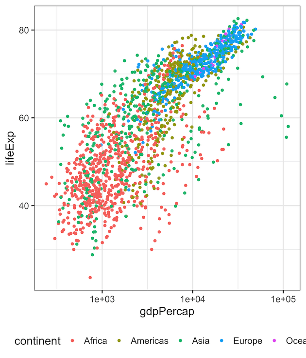
Wrap Legend (color) into Two Rows
To fold a long horizontal legend into multiple rows, use guides() with guide_legend() and set nrow. Since the legend is created by color, we target the color guide. Adding byrow = TRUE lays items out row-wise, which is usually more natural for a bottom legend.
gapminder |>
  ggplot(aes(gdpPercap,lifeExp, color=continent)) +
  geom_point() +
  scale_x_log10()+
  theme(legend.position = "bottom")+
  guides(color=guide_legend(nrow=2, byrow=TRUE))
And we get scatterplot with two rows for legend’s values at the bottom of the plot.

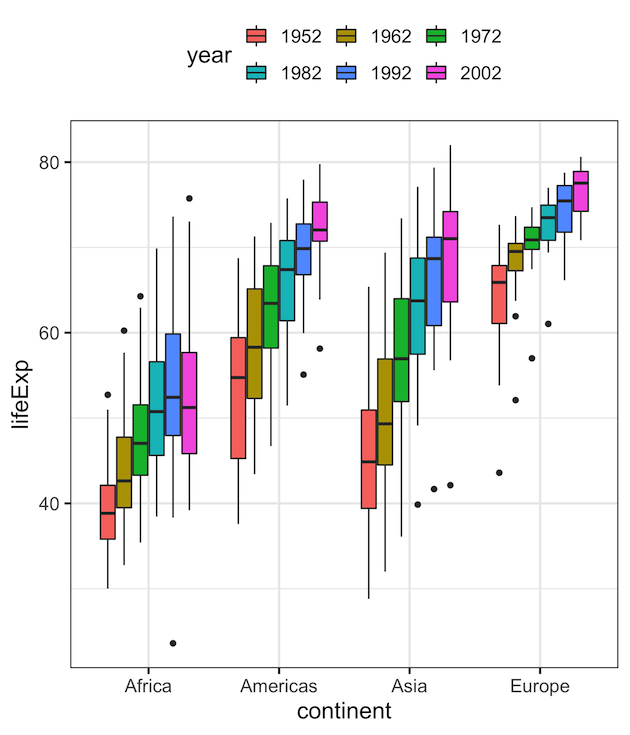
Wrap Legend (fill) into Two Rows
If your legend is generated by the fill aesthetic (for example, grouped boxplots), you must target fill in guides(). Below, we simplify the data and convert year to a factor to produce multiple legend entries, then wrap them into two rows at the top of the plot.
To show that let us make a grouped boxplot. First, let us simplify gapminder data to make grouped boxplot.
df <- gapminder |>
  filter(continent != "Oceania")%>%
  filter(year %in% c(1952,1962,1972,1982,1992,2002)) %>%
  mutate(year=factor(year))
We make grouped boxplot and add legend with “fill” argument. And use guides() function with fill argument specifying the number of rows for legend.
df |>
  ggplot(aes(continent,lifeExp, fill=year)) +
  geom_boxplot() +
  theme(legend.position = "top")+
  guides(fill=guide_legend(nrow=2, byrow=TRUE))
In this example, we have two rows of legend on top of the plot.
Make a Multi-Column Vertical Legend (ncol)
When the legend is on the right (vertical stack), a long legend can also be tightened by splitting it into multiple columns. In that case, use ncol instead of nrow. This is helpful when you want to reduce the chart’s height impact from a tall legend.
gapminder |>
  ggplot(aes(gdpPercap, lifeExp, color = continent)) +
  geom_point() +
  scale_x_log10() +
  theme(legend.position = "right") +
  guides(color = guide_legend(ncol = 2)) +
  labs(
    title = "Vertical Legend with Two Columns",
    subtitle = "guides(color = guide_legend(ncol = 2))",
    x = "GDP per capita (log10)",
    y = "Life expectancy"
  )

Tips for Cleaner Wrapped Legends
- Shorten labels: Consider abbreviations or concise labels if categories are verbose.
-
Adjust spacing:
theme(legend.text = element_text(size = 12))can improve legibility without causing overflow. - Order intentionally: Reorder factor levels to group related items on the same row/column.
-
Match orientation to placement: Use
nrowfor horizontal (top/bottom) andncolfor vertical (left/right) legends.
Conclusion
Wrapping a long legend into multiple rows or columns in ggplot2 is easy with guide_legend(). By specifying nrow or ncol, you can split the legend items across lines and prevent them from being cut off when placed at the top or bottom of the plot. This small adjustment improves readability, especially in publications, dashboards, or presentations where space is limited.
Frequently Asked Questions (FAQs)
-
What if my wrapped legend still crowds the plot?
Consider tightening plot margins, moving the legend outside the plotting panel (via theme tweaks), or shortening category labels so they fit more comfortably across rows/columns. -
Should I wrap a legend or remove it entirely?
If the legend is essential for decoding the chart, keep it and wrap it. If your plot is labeled directly (e.g., annotations or facet labels make categories obvious), removing the legend may reduce clutter. -
How can I improve readability for print or slides?
Increase legend text size, ensure good color contrast, and reduce the number of categories shown. Larger keys and succinct labels help when viewed from a distance. -
What if my categories have very long names?
Use shorter labels or line breaks in labels. You can also rotate or wrap legend text via theme settings, but simpler labels usually yield the cleanest results. -
Will wrapping change the order of legend items?
Wrapping preserves the order; it only changes the layout. If you need a different order, reorder the factor levels in your data first so the legend reflects your intended grouping.
Explore the Complete ggplot2 Guide
35+ tutorials with code: scatterplots, boxplots, themes, annotations, facets, and more—tested and beginner-friendly.
Visit the ggplot2 Hub → No fluff—just code and visuals.

