Last updated on May 9, 2021
In this tutorial, we will learn how to add regression lines per group to scatterplot in R using ggplot2. In ggplot2, we can add regression lines using geom_smooth() function as additional layer to an existing ggplot2. We will first start with adding a single regression to the whole data first to a scatter plot. And then see how to add multiple regression lines, regression line per group in the data.
Let us load tidyverse and set ggplot2 theme with bigger base size for legible axis labels.
library(tidyverse)
theme_set(theme_bw(base_size=16))
We will use our most beloved data set, i.e. palmer penguin’s data set to make scatterplots with regression lines. Penguin Data was originally collected and made available by Dr. Kristen Gorman and the Palmer Station, Antarctica LTER. And Thanks to Alison Horst, we now have the the data easily available.
p2data <- "https://raw.githubusercontent.com/datavizpyr/data/master/palmer_penguin_species.tsv"
penguins_df <- read_tsv(p2data)

## Parsed with column specification:
## cols(
##   species = col_character(),
##   island = col_character(),
##   culmen_length_mm = col_double(),
##   culmen_depth_mm = col_double(),
##   flipper_length_mm = col_double(),
##   body_mass_g = col_double(),
##   sex = col_character()
## )
How to Add Regression Line with geom_smooth() in ggplot2?
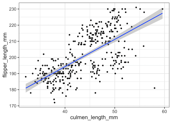
Let us start making a simple scatter plot between two quantitative variables and save the plot as ggplot object first.
sc_plot <- penguins_df %>%
  ggplot(aes(x=culmen_length_mm,
             y=flipper_length_mm))+
  geom_point()
Now we can add regression line to the scatter plot by adding geom_smooth() function. geom_smooth() in ggplot2 is a very versatile function that can handle a variety of regression based fitting lines. For example, we can fit simple linear regression line, can do lowess fitting, and also glm. In this example below we have specified the argument method=”lm” within geom_smooth() function. This adds a regression line using linear regression to the scatter plot.
sc_plot +
  geom_smooth(method="lm")
If we don’t specify method argument to geom_smooth() function, it uses loess() for less than 1,000 observations. We get a scatter plot with a single regression line with error band showing how good the fit is.
How to Add Multiple Regression Lines to Scatterplot with geom_smooth() in ggplot2?
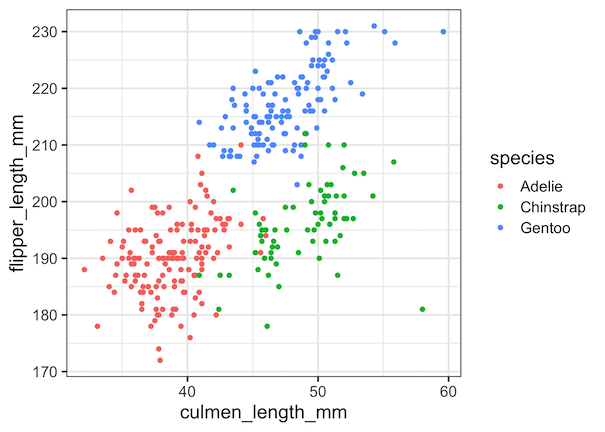
When you have additional variable corresponding to the quantitative variables, we can show the data corresponding to different groups by different colors. We specify color argument with the grouping variable inside aes() function in ggplot2.
penguins_df %>%
  ggplot(aes(x=culmen_length_mm,
             y=flipper_length_mm,
             color=species))+
  geom_point()
ggsave("scatterplot_with_multiple_groups_ggplot2.png")
Now we have the scatter plots with points colored by the third variable.
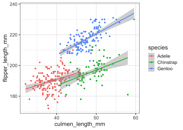
To add regression lines for each group colored in the data, we add geom_smooth() function.
penguins_df %>%
  ggplot(aes(x=culmen_length_mm,
             y=flipper_length_mm,
             color=species))+
  geom_point()+
  geom_smooth(method="lm")
ggsave("add_regression_line_per_group_to_scatterplot_ggplot2.png")
Now we have a scatter plot with regression line for each group. Note the only difference between making a scatter plot with single regression and multiple regression lines is to specify the grouping variable to color argument inside aes().
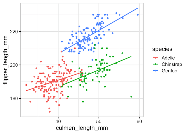
We can also remove the confidence interval band around the regression line using se=FALSE option within geom_smooth() function.
penguins_df %>%
  ggplot(aes(x=culmen_length_mm,
             y=flipper_length_mm,
             color=species))+
  geom_point()+
  geom_smooth(method="lm",se = FALSE)
ggsave("add_regression_line_per_group_without_se_scatterplot_ggplot2.png")
This makes a scatter plot with just regression lines alone.
Explore the Complete ggplot2 Guide
35+ tutorials with code: scatterplots, boxplots, themes, annotations, facets, and more—tested and beginner-friendly.
Visit the ggplot2 Hub → No fluff—just code and visuals.


